28 December 2005
Art: Paying for it
Happy Birthday to my Dad.
Patrons are, if anything, essential and indispensable. No matter what the art; good, bad, or ugly, someone has to pay for it. Some people get really bent out of shape about art “selling out”, and I don’t blame them. It is annoying to think that something so crude as money is driving something so noble as art.
So I was paging through another great Christmas present that came my way this week--this book, which has the following advice in it:
. . . Oh ye artists who can spell, speak French, and read Homer, never show your patrons they speak bad French, or read Bad Greek, and spell carelessly, but listen to their French as if it was Racine’s, to their Greek as if old Homer himself were spouting, and read their epistles as if they had orthography, grammar, and common sense. Do this, and you will drink their claret, adorn their rooms, ride their horses, visit their chateaux, and eat their venison. But if, on the contrary, you answer the French not meant for you to understand, rectify their quotations which you are not supposed ever to have heard of, and discuss opinions only put forth for you to bow to, you will not eat their venison, you will not adorn their apartments, you will not ride their horses, you will not drink their claret, or visit their chateaux, at any rate more than once. And, so, artists, be humble and discreet.
So wrote Benjamin Robert Haydon, an “awkward man and an unsuccessful artist”, according to Grove (pg 427-8).
I’ve mentioned Sherrie Levine’s statement before, but today it is relevant for a part I didn’t talk about then. The statement ends with “The birth of the viewer must be at the cost of the painter.”
Is she right about that? I’m inclined to think that she is. The artist/patron relationship is, in every case I can think of, one in which one party bows to the other. Has it ever been otherwise?
27 December 2005
Scott Kim
This year, I got a really interesting book for Christmas that introduced me to the very fun art of Scott Kim. He's great at playing with the way we see and read--a topic I've written about before, and he comes up with the most amazing things as a result. Here's one of my favorites.

24 December 2005
Christmas Eve
December 24th – Christmas Eve. I used to think that Christmas Eve was a real throw away holiday. Then I lived in Germany where Christmas Eve is THE big deal of the season. The German name for Christmas ‘Weihnachten’ literally means Holy Night, which of course, is the night of the 24th.
Criticize it if you will, that’s your right. But I am really happy there is a Christmas to celebrate. I’m glad that one of the biggest days of the year centers on peace and good will. If it doesn’t for you, it ought to and you are missing out on the beauty of it all.
I view of that, I’ve trolled the web for some of the most peaceful art that I know of. The world seems like a better place when I think about it while looking at these, from Josef Albers.


23 December 2005
A recommended book
This little picture is from the book (or pamphlet, or reader, or booklet?) called Communications: The Transfer of Meaning. There are illustrations like the one here throughout the book. It was required reading when I was an undergraduate--part of my my failed attempt to become an artist. So I went out and got an overpriced copy. I'm still glad I did. It is a good little "thinker" book.

I somehow lost it. I don't even know when. Maybe when we moved to Germany? I can't imagine selling it or giving it away. It's only 48 pages. I definately could have moved it.
Anyway, a few months ago when I knew we were having company for the holidays I bought a copy to have brought here from the states. Now that I've got it, I'm super happy, and reliving my introduction to many of the ideas that are still swimming around in my brain. This book is very likely to be featured in future blog posts. Anyway, biographical though it may be, this book is responsible for my own interest in how we see, percieve, internalize etc. the world around us. Once we've done all that, the products we generate are equally worthy of consideration.
22 December 2005
A recommended site
There are, frankly, a lot of very good sites out there for your art fix. I've admitted before that I'm not much of an architecture expert. Actually, I'm not even really knowledgeable. Enter a weekly dose of architecture. Each week there's a new focal point.
I came across the site quite by accident, and I honestly can't remember the chain of art type sites that eventually lead me there. I discovered them last week, when lo forth and behold:

I saw something I recognized. Finally, a picture from the city I live in appears on my site. Beirut isn't the first city that comes to mind when you ask people to list architectural hotspots. Anyway, I have to admit that their analysis made me smile.
21 December 2005
Art History: Problematic situation #5
This is part of an ongoing series.
I’ve addressed some of the extensions of today’s problem in Art History before, but I thought it would be good to bring it back to its roots for a moment. This is a problem for art and anything else that has a history.
Speaking of women and their anonymity in history, Virginia Woolf wrote:
“Nothing remains of it all. All has vanished. No biography or history has a word to say about it.. . . I would as soon have her true history as the hundred and fiftieth life of Napoleon or the seventieth study of Keats and his use of Miltonic inversion . . . ”
That comes from pages 89-90 of her A Room of One’s Own, published in 1929. I’ve tried to find it and I can’t, but I’m sure she challenged her readers to write the history of women. To search out what their lives were like, and add that as a counterpoint to the history we already had.
I think the call has been answered, not thoroughly or perfectly, but at least acknowledged. I distinctly recall Women’s History Month and Black History Month in my elementary school in middle America. I remember that when we learned about the westward expansion of the United States, we learned about the Trail of Tears too. History, for at least two decades then, has ceased to be the domain of the victor telling the story from their point of view, or to reinforce their agenda.
What about art and its history, then? Do we allow art history to be the domain of the strong, famous, most successful, most shocking, most popular, most relevant to the Next-Big-Thing?
20 December 2005
Happy
My sister just arrived. I've got an undercurrent of happiness that is preventing most critical and analytical thought. So, here's a Calvin and Hobbes for you. It is from April 30, 1993. Enjoy.

19 December 2005
Art in the Movies
I’m thinking about art that shows up in Hollywood productions, not the relative merits of these sorts of movies-as-art. That would be an interesting post though.
A fantastic movie full of fantastic art is The Age of Innocence. Someday, I’ll make a list of every famous and not famous painting sitting there understatedly in the background of nearly every shot. It will be a big job, but I would actually enjoy doing it. Maybe it has been done. If so, I want the list so that next time I watch it the experience will even more fantastic than it already is.
There are other movies where the art factor is so blown out of proportion that it becomes irksome and frustrating. For me, What Dreams May Come is one such movie. At first, it was kind of neat that Robin Williams kept flitting from one painting-made-alive into another. It was a creative way to tie his story to his wife’s life. After several repetitions of this theme it began to look not so much like creativity but the lack of it. I found myself wondering which famous painting was going to be plagiarized next, and wishing the art director had paid a little less attention during their art history lectures.
Of course, we can’t forget movies-using-art scandals. James Cameron didn’t have permission to use all of the art that met its demise on the Titanic, and had to settle out of court to avoid being sued.
I’ve also been creating a list in my mind of all the movies I’ve ever seen that involve art-theft. It’s a pretty long list.
If you have a favorite art-filled movie, let me know.
18 December 2005
William Kentridge
I first came across William Kentridge when I was working for these folks as an intern. That, incidentally, was one of the best jobs I have ever had.
Anyway, I was researching the arts situation in South Africa in that capacity, and you don’t have to nose around in that region too long to find Kentridge. He’s a white South African who studied politics and shortly thereafter started doing art-type stuff. Obviously, I guess, much of his work centers on Apartheid and related issues.
I am really interested in his movies, which involve a production process that destroys the illusion regular movies present. They are animations. He draws each frame, and instead of creating a separate picture for the next frame he shoots it, and then erases and redraws on the same paper.
Anyone who has spent much time with an eraser knows how well that works. Little remnants of the previous image remain. It is a cool process that directly addresses impermanence, distortion, and the resurgence of the past. This is mixed with political messages and critiques, the implications of which challenge the assertion that contemporary art lacks relevance. I liked it back then so much that when I was accepted to grad school he was one of my proposed thesis subjects.
Now that I’m half way through a different topic I kind of wish I could go back to Kentridge.
17 December 2005
William Wegman
The Robert Klein Gallery in Boston has an impressive list of artists on their list. Clicking around there, I noticed quite a few big names in photography, as well as some that sort of surprised me.
The first: NASA. In addition to prints from photography's masters, The Robert Klein gallery can get you some pictures from the surface of Mars or shots of the moon that definitely weren't taken on earth.
The second: William Wegman. I don't know why I bother being surprised. He's included in the text book for the Contemporary Art class I took as an undergrad. He photographs dogs in as many ways, settings, costumes, environments that he can conceive. Go check it out. He's sort of the Anne Geddes of dogs.
So that got me thinking. If Wegman can be art, why do I cringe at Geddes? What's so wrong with being cute anyway? What's so wrong with being commercial? What is so wrong with babies? Does making room for ugly art mean there is no room left for charming, pudgy, human and dog babies?
16 December 2005
Viewing art: Originality
From Dictionary.com:
original
1. Preceding all others in time; first.
2. a. Not derived from something else; fresh and unusual: an original play, not an adaptation.
b. Showing a marked departure from previous practice; new: a truly original approach.
3. Productive of new things or new ideas; inventive: an original mind.
It is hard for me to think about contemporary art with out Sherrie Levine's Statement. The whole thing is short enough that I could reproduce it here without making my post longer than usual, but I want to focus on one idea from it. Here's some of the text:
"The world is filled to suffocating. Man has placed his token on every stone. Every word, every image, is leased and mortgaged. We know that a picture is but a space in which a variety of images, none of them original, blend and clash. A picture is a tissue of quotations drawn from the innumerable centers of culture."
I wrote recently about artistic independence, and this post is, I suppose, the other side of that coin. My main point there was that artists refer to, draw on, and borrow from each other and those actions can lead to false conclusions about what an artist (or a non-artist) was or was not doing.
Levine's Statement directs this issue away from artists/viewers and toward the image itself. Images simply are an agglomeration--as she calls it, a tissue of quotations. One thing of value that has come from postmodernism is this realization; that when we speak of originality, we generally are thinking of something much, much smaller than true originality would demand. A representation, any representation, is a re-presentation, a regurgitation of input. Originality of images must operate within this overarching reality, and that means it isn't actually originality.
15 December 2005
Art and Music
Ah music--to artists 150 years ago, music was synonymous with freedom. It was their ticket out of representationalism and into the hitherto unexplored realms of abstraction.
 This James Abbot McNeil Whistler's Symphony in White No. 1: The White Girl from 1861-62.
The title is taken from music, and so is the apparent lack of subject matter. Sure, there's a girl there, but she is white, white dress, white background and forgound, white, white, white. It isn't about her. It's about the color. Whistler would get far more abstract than this, but even his most daring Falling Rocket is only a partial abstraction.
So time goes by and things change. About fifty years after Whistler's image, Wassily Kandinsky took music as the ideal for the visual arts. He theorized and wrote about the confluence of music and color and painting, and started naming his paintings the way musicians name their compositions: improvisation, composition, contrasting sounds, etc. By the time we get to Kandinsky Modernism is in full swing. Cubism has already evolved through its first two phases, and the influence of academic "correct" painting had fallen considerably.
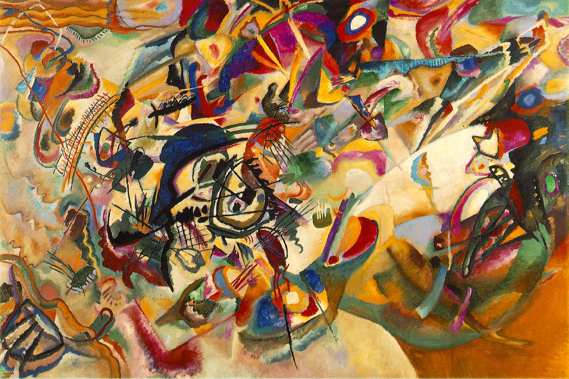 This is one of his 1913 compositions (number seven for those of you who care. And incidentally, the numbering thing also derives from music (think of all the numbered classical compositions out there). Kandinsky was able to take the influence of music further than Whistler ever had. Music is a far more overt inspiration and starting point for these later works.
Once again, time goes by and things change. Another fifty years pass. 100 years after Whistler's Symphony in White, Clement Greenberg wrote:
". . . the unique and proper area of competence of each art coincided with all that was unique to the nature of its medium. The task of self-criticism became to eliminate from the effects of each art any and every effect that might conceivably be borrowed from or by the medium of any other art. Thereby each art would be rendered 'pure' and in its 'purity' find the guarantee of its standards of quality as well as of its independence."
In other words, painting should not try to imitate music, and sculpture should not try to imitate literature, and music and literature should not try to imitate painting or sculpture. This was Greenberg's attempt to put some rules into an art world that, already in 1960, was all wrong.
14 December 2005
Conceptual Art
Conceptual Art really makes a lot of people mad. I think it makes them mad because it actually makes them feel stupid, and people don't like to feel stupid especially when it is an inanimate "dumb" object that makes them feel that way, so instead they get angry.
A bit of history seems called for. Conceptual Art is now a rather old thing as far as contemporary art goes. It has come and gone (I think). By the early 1970s, Conceptual art was already a well developed thing and one the wane.
In 1969, Sol LeWitt wrote 35 'Sentences on Conceptual Art'. Here are some of the highlights:
5. Irrational thoughts should be followed absolutely and logically.
10. Ideas alone can be works of art; they are in a chain of development that may eventually find some form. All ideas nee not be made physical.
13. A work of art may be understood as a conductor for the artist's mind to the viewer’s. But it may never reach the viewer, or it may never leave the artist's mind.
18. One usually understand the art of the past by applying the conventions of the present thus misunderstanding the art of the past.
24. Perception in subjective.
32. Banal ideas cannot be rescued by beautiful execution.
33. It is difficult to bungle a good idea.
35. These sentences comment on art, but are not art.
So conceptual artists did a lot of this kind of thing:

This is Joseph Kosuth's 1966 Titled (Art as Idea as Idea) [Water]. Conceptual Art on its own, isolated from the events that preceded and surrounded it, really does make you shake your head. But I think it makes sense and even seems pretty normal considering what was going on at the time. I think these artists and the industries that allowed them to function were sick of the avant-garde hero demi-god role that artists had been playing. There was a huge disillusionment in that cult and in the ideas of authenticity, originality, progress, and so on. Modernism was failing and with that failure looming, Conceptual Art seems to have been a coping mechanism.
People argue that stuff like this is more than an empty threat to the sanctity of art. They argue that it does actual harm to it. I can't say I agree with that. As I see it Conceptual Art elicits two reactions.
1. People see it, furrow their brow, scratch their head, move on.
2. People see it, hate it, revolt against it, dig their heels in opposite it.
In either case, the viewer walks away from Conceptual works with ideas about art. Either their idea has evolved or it hasn't. I doubt that matters. But whatever their thoughts about art may be, they've got 'em, and conceptual art got them thinking.
13 December 2005
. . . and Government Art
So yesterday I made a case for art and not art rather than good and bad art. I need one more disclaimer on it. There are all these areas where art is used as a descriptor on a specific category of creation: media arts, arts and crafts, folk art, decorative art, etc. My previous post wasn’t intended to castigate or condone any of these art derivations/deviations/divisions. They exist in their own right apart and outside of the art I wrote about yesterday.
And that brings me to Government Art, which is one of those categories outside the scope of art as described yesterday. I’ll just come right out and say that most of what governments make to present themselves to the world stinks. It isn’t art. Government Art is only called that because that’s what they claim it is. Most of the art in this category is an oxymoron like “honest politician”, but there are a few notable exceptions.
We aren’t talking about the exceptions today though. We are talking about the rule.
The first example is from the US Capitol building, which, thank goodness, wasn’t even mentioned in any of the art classes I have ever taken. Nothing from the US Capitol is in any of my art books either. If you click here you’ll find an image of the statuary on the pediment of the Senate entrance. All classically rendered, proportional etc., I can’t really object to the looks of it except to say that it is fairly blah. But look at what is depicted. The following is a statement from the US government’s site about this statuary:
The sculptural pediment over the Senate entrance on the U.S. Capitol's east front is called Progress of Civilization. The center figure is America, who stands with an eagle at her side and the sun at her back. On the right, a woodsman, hunter, Indian chief, Indian mother and child, and Indian grave represent the early days of America. On the left the diversity of human endeavor is suggested by the soldier, the merchant, the two youths, the schoolmaster and child, and the mechanic. Completing this side of the tympanum are sheaves of wheat, symbolic of fertility, and an anchor, symbolic of hope; these elements are in contrast with the grave at the opposite end of the tympanum.
What a load of propaganda. But that’s what Government Art generally is, and luckily, most of it is so devoid of educational value that nobody is taught about it. At least, art students aren’t. I frankly think that the sculpture should be taken down.
On a different, but equally bad note, Bosnia has recently added this to their collection of state art. Government Art (with only a few exceptions) is a travesty.
12 December 2005
Good Art Bad Art
Good and bad are dangerous terms almost everywhere and especially in art. The first, most obvious reason is that taste changes. We get sick of the same old same old beautiful (or meaningful or moving or inspiring or whatever you want art to be) stuff and find that we need something new. This has been going on for millennia, and everything about modern life seems to support the idea that this (if not a whole lot else) will continue to be as it has been in the past.
The second reason why the terms good and bad are dangerous for art is that they set up a specific operational structure under which art must labor. If there was such a thing as "good" art it would presuppose both the existence of "bad" art and specific criteria by which that distinction had been reached ("this art is good because x, y, & z"). That set of criteria would only be useful if it applied to all art everywhere for all time. For the reason why such criteria are impossible to identify, reread the first, most obvious reason. I wish to argue here that there is no such thing as good art and bad art—there is only art and not art. Either it is or isn’t. There are no varying degrees of art-being. It’s all or nothing here, and therefore "good"” is meaningless. Think of it like this: an organism is a human being or it isn’t. There are no "kinda-sorta" humans.
Please don’t take this further than what I have just outlined. A Monet is usually a good example of Impressionism, and a Warhol is always a bad example of Neo-classicism, and so on. Specific works of art can be good or bad illustration of specific things, but that has nothing to do with being good or bad art. Also, I think it is fair for individuals to decide what for them is good or bad art, acknowledging that these assessments fail to be universally applicable.
11 December 2005
When I dream, I dream of. . . .
I thought I would share a bit of what I think is architectural perfection.
Several years ago I came across a floor plan that I really liked. Really, really liked. I liked it so much that I saved a copy of it on my computer and labeled it "dream house".
The original wasn't perfect, so I started making changes. Just minor things, like adding a wall so that the kitchen isn't soooo huge (which magically added a laundry room at the same time). So here it is:
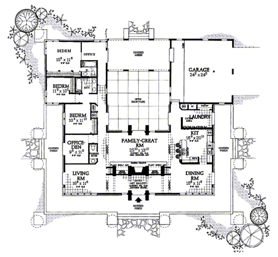
Here is a list of things I think are good about it:
1. The garage is not visible from the front of the house, but it is located close to the kitchen (good for hauling in groceries).
2. The bedrooms are closely grouped (which means I wouldn’t have to walk through the entire house to comfort a crying child in the dead of night).
3. The entryway doubles as an art gallery, and doesn’t open directly into living spaces.
4. I like the internal courtyard.
5. The house is symmetrical, which appeals to my sense of design and proportion.
6. It is a single story house, which means that I could grow old in it—no stairs to negotiate.
7. It is not too big for me to keep clean on my own. (Well maybe it is too big. I don't know about that anymore.)
8. There are enough bedrooms for all the kids I could ever hope to have, and plenty of room for grandkids or otherwise guests.
9. I really like the large porch area all around the front and sides. It seems perfect for a summer evening.
The mid-westerner in me really would like to see a basement added to this house, and that can be done fairly easily, I think, just by adding a staircase somewhere, from the garage perhaps.
There are a few, more fundamental problems with my dream though. Like the fact that I prefer to live in cities where a home like this would be prohibitively expensive, that I detest the "have to drive everywhere" culture of the US that a house like this would impose on me, or that I am too security minded to actually have a home with so many doors to the outside.
So the question is, is this house actually perfect? Is it only perfect if it can be put into practice?
10 December 2005
For Megan
Happy Birthday Megan.
Five and a half years ago, Megan wasn't married, didn't blog, didn't have a cute little girl in her life, and about a million other things that are different these days. Matthew and I were Newlyweds (really?) and she came to visit for a week, probably around spring break.
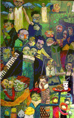
While she was there, I showed her some work by Aaron Jasinski, an artist who at that time was in the same place we were. I had seen some of his paintings and liked them. I even contacted him about buying one (but the one I wanted wasn't available. *sigh*). He's got a catchy name that was easy not to forget, so over the last five or six years I've been watching him. His web site has gotten better and better. You should check it out (click on his name up there).
Anyway, there was one painting in particular that Megan liked a lot, and I can't find it anymore. It had a princess on a horse, and a knight in shining armor kneeling before her and offering a flower. In the absence of that one, I found this one that I think represents the artist's style. It is called Devoted Ambitions from 2004. There is something perfectly happy about each of his paintings, and I wish I had a more academic way to phrase that, but since I don't, there it is. Happy. One of these years, I really want to buy an original because I think I need more happy things in my life and in my art collection.
Anyway, I hope you have a great birthday, Megan.
09 December 2005
Textile Art
If the phrase "textile art" makes you think of this please keep reading. Your horizons are about to expand.
Art and textiles have a long history together. "Oil on Canvas", for example, is such a common thing to read in a museum that it may seem to loose its meaning. Just so you know, oil doesn’t always go on canvas. Sometimes it is oil on something else. Not being a painter myself, I have to guess about why an artist would choose canvas over a smooth board. Maybe the texture of the canvas is desirable in some way. Maybe an artist out there can tell me.
Anyway, the canvas is not the star of the painting show, the oil is. Canvas for hundreds of years was concurrently indispensable and invisible, like the backstage crew at the theater. Then, about a hundred years ago, artists started leaving bits of canvas untouched. You might think to call the painting unfinished, but it was finished. Intentional blank spots. Little bits of canvas peeking through the paint, present in a way it hadn’t been for as long as it had been.
The idea of liberating canvas got taken a lot further in the 1960s. Eva Hess made a really great piece of art that has been written and theorized about, perhaps endlessly. It was made in 1966, and is called Hang Up.
 What you see is a frame, wrapped in pieces of canvas that have been dipped in paint. The wire protruding from it falls out into the space in front of it. It both hangs and drags, an interesting combination. I think it is brilliant, and I’ll try to give a few reasons why.
First, it isn’t comfortably either painting or sculpture and back in the mid 1960s, that was a big deal. It was one of fine art’s "hang-ups". The distinction between the two and the requirements of each was a big messy problem. This piece is a perfect illustration of what some people thought was completely wrong with art, and others thought was completely right. Can sculpture hang on the wall? Can painting flop on the floor?
Second, the canvas and paint are there, but they are wrapped around the frame, which this time, isn’t around anything. The frame is the point of interest because there is a void within it. Again, this raised questions about the nature of painting. Can a painting be empty? Can a painting be not-painted?
What started out as a bit of freedom for the canvas, paint, and painter grew into this piece that puts so many questions to the viewer about materials and art. So anyway, next time you see a painting, ask yourself what it was painted on. It might make a difference.
04 December 2005
Composition #5: Asymmetry
A little while ago I wrote this post about how reading left to right influences our ideas of balance when we look at paintings (sculpture too, but whatever). I got one comment that seems to substantiate my idea that asymmetrical compositions rely on this left-right predisposition to really work.
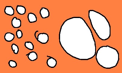
Anyway, there are lots of ways to get asymmetrical balance. You can do it by counter-weighting a few large things on one side with many smaller things on the other. I made the following dinky drawing to show this.
Asymmetry can also work when the objects depicted have sense of direction. For example, if someone is looking off to the right, you can place them off center to the left without making the image look off balance or empty. The viewer assumes that the depicted person’s gaze is going somewhere and that seems to make sense of the space. Here’s one of the few pictures of me you will ever get on this site, so enjoy it.

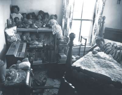
Sometimes asymmetry is deliberately used to allow two or more focal points to compete for interest. Artists can do this to create tension in an image. It makes it more interesting, and adds subtle inflections of meaning. This picture is from Sally Mann’s At Twelve series. The girl and her baby (the subject) are almost crowded out of the frame by all the other things to look at.
03 December 2005
Art History: Problematic situation #4
I thought those of you out there who like art but haven’t really studied art history would appreciate an overview of art history methodologies. Methodology is a big word, and in this context it means “approach”. These are the most common ways that scholars look at and judge art. They are not all compatible, and some are mutually exclusive. Each will lead you to a very different appraisal of any given work. To illustrate, I’ve chosen Daumier’s Third Class Carriage from 1865. You can refer back to it for each of the methodologies below.
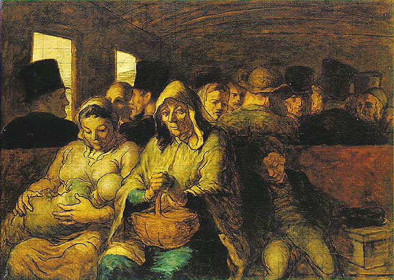
Formalistic—This approach might seems inappropriate unless the art in question is one of total abstraction, but it yields interesting content anyway. The color, line, value, and composition are the only things a formalistic reading concerns itself with. You’d note the heavy outlines, the subdued tones, the crowded composition. All of this would then feed into one of the other approaches, which would help create an interpretation of those formalistic elements.
Psycho-analytic—Typically, this methodology focuses on the artist and how their work illustrates their various psychoses. Using it with the Daumier above, you’d want to also investigate the psychologies of the people he depicts, and if these depictions are in any way autobiographical. Freud’s ideas are usually at the center of these writings. It doesn’t seem to matter that Freud got a lot wrong, so I’m not really fond of this methodology.
Socio-historical—This methodology is concerned with what was it like to be an artist, to be a viewer, and the condition of art at the time it was done. Was it common to depict scenes like this? Who was the intended audience? Is the artist moralizing, glorifying, condemning anyone?
Feminist—The feminist methodology is like the socio-historical, but woman-centric. Relevant questions include, “what was the condition of women at the time the art was done?”, “what was it like to be a woman artist?”, “what was it like to be a woman viewer?”, “whose gaze is it, a man’s or a woman’s?” Daumier wasn’t a woman, but that doesn’t mean his works are outside the scope of this methodology.
Marxism/class—Not too different from the feminist critique, the Marxist approach centers on class, status, money, power, and so on. Relevant questions include, “who were the viewers?”, “who were the artists?”, “what was their status?”, “how is status depicted?” It makes a difference if Daumier was on a level with the occupants of the third class section, or if he depicts them as a voyeur with a better seat.
Iconography—This one is tricky, because there are times when a rock or an apple or a sailboat is only that and nothing more. Other time, depicted objects, placement of people, gestures, and other visual devices carry symbolic weight that is necessary to understand the intended message of a piece. I don’t have any idea if a symbolic reading of Daumier’s work has been done or if anything came of it if it has been.
Semiotics-- This has to do with visual culture and how a piece of it relates to the whole. The fact that we look at Daumier’s heavy black outlines and we think of cartoons is relevant here. This approach is concerned with what images mean and why they mean them. So if you find Daumier’s painting a bit, well, depressing, this approach is all about figuring out why it seems that way.
So why does this qualify as one of Art History's problematic situations? Well, there are at least seven ways to look at any work of art, yielding seven potentially mutually exclusive interpretations. This really only works if you already believe that art is something different for each viewer out there.
02 December 2005
Composition #4: Symmetry
A friend mentioned on my husband’s family-and-friends-only site that a post about symmetry would be welcome. So, in the context of these little ditties about composition, here it is.
Symmetry usually equals instant static balance and boredom. Boring has an undeservedly bad reputation when it comes to composition, because if the image set up is boring, the image content can shine. Warhol’s Marilyn is a good example.

She is smack in the middle, and that keeps your attention on her. If she were slightly off center the image wouldn’t be the same. She would seem much more interesting, alive, in possession of a soul. In the center, she is the object of our gaze, and not much else. That kind of boredom is a great tool for artists to use.
Here’s an older example, Durer’s Apostles. Instead of one figure, there are four evenly spaced, equally large, symmetrically organized people.

Finally, here is my all time favorite symmetry artist. I once saw an exhibition of a whole lot of these in Mannheim, Germany. They are really stunning in real life, and huge too.

This is Victor Vasarely's 1969 oil-on-canvas Vega-Nor.
01 December 2005
Composition #3: Uncomposed
Spell check doesn’t like the word uncomposed, so I’ll just go ahead and take credit for the discovery of a new word. It seems so much more fitting than discomposed, which spell check prefers. Discomposed seems to imply that the thing used to be composed, and is now in a temporary, alternate state. Uncomposed (to me anyway) feels more like intentional, permanent not-composition. That’s what we’re talking about today.
This is by Gustav Courbet, a mid-1800s French realist. This piece is monumental at over three meters high and six meters wide. It is called A Burial at Ornans.
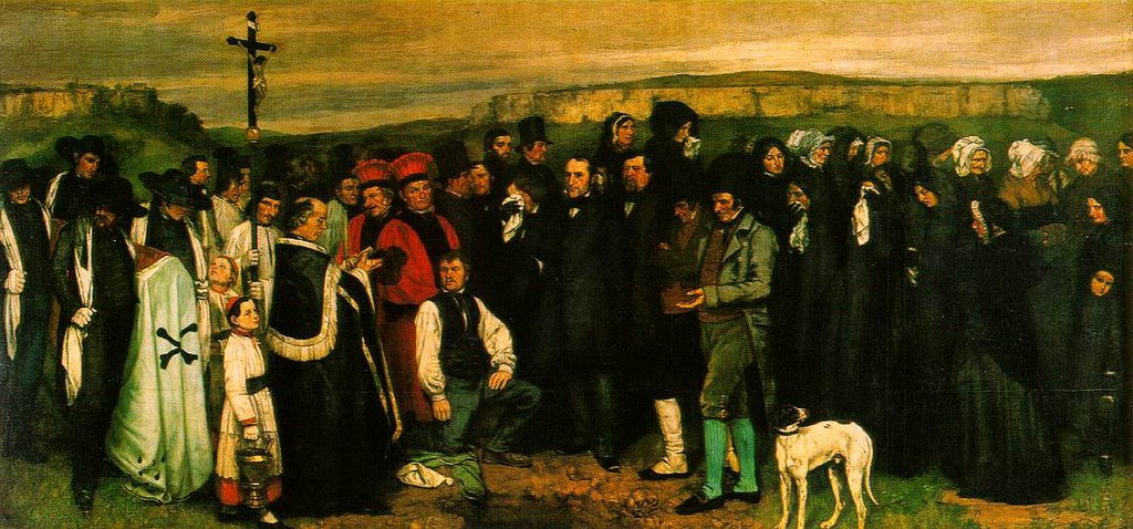
Here’s an interesting summary of the work and its relationship to Courbet’s career.
Anyway, here you have none of the intentional lead-the-eye-through-the painting devices that were customary in French painting at the time A Burial at Ornans was painted. The people are just there rather like they would be in real life. Furthermore, like shap shots that you’ve got in your own collection, people are cut off, the dog’s feet are missing, and most of the people in the image aren’t paying attention or are looking away.
If I were a painter, it would take a lot of effort to choose not to correct life’s little imperfections. That’s actually one of the things that is kind of magical about art. You can create something that strongly reminds the viewer of their visual world even if it is totally contrived and divorced from it.
Uncomposition isn’t restricted to representational painting either. There are examples of it all over, but here’s a famous one:

That’s Jackson Pollock in an action shot of his action paintings. There is no center, no sense of dominance, foreground, background, focal point, light shadow, etc. Not there. Like Courbet's, this image isn’t about clever artistic composition.
Subscribe to:
Posts (Atom)
