Showing posts with label viewership. Show all posts
Showing posts with label viewership. Show all posts
26 April 2007
See and be Seen
I'm about half way through the first book in the Cairo Trilogy by Naguib Mahfouz. Why am I reading the trilogy? First, because Mahfouz is the only Arabic-language writer to ever receive the Nobel Prize for literature. Second, it came highly recommended. Third, it is well written. Not even being translated into English could ruin the quality of the writing.
(those reasons are in chronological order, not priority order. Nobel Prizes have not redeemed other authors I’ve picked up in the past)
So, like I said, I'm about half way into the first book, Palace Walk, and I just (literally 5 minutes ago) read the passage where Amina, the mother in the story's central family, has been persuaded by her children to venture out into the street for the first time EVER. This is a very traditional family, with a very authoritarian, unkind, and distant father. He leaves for a short business trip when her teen-aged and adult children convince her that there is no sin in visiting a nearby mosque/shrine (Amina is devout). She covers herself with her maid's shawl, veils her face, and is accompanied by her male sons. We get a third-person omniscient description of it:
As she crossed the threshold of the outer door and entered the street, she experienced a moment of panic. Her mouth felt dry and her pleasure was dispelled by a fit of anxiety. She had an oppressive feeling of doing something wrong. She moved slowly and grasped Kamal's hand nervously. Her gait seemed disturbed and unsteady as though she had not mastered the first principles of walking. She was gripped by intense embarrassment as she showed herself to the eyes of people she had known for ages but only through the peephole in the enclosed balcony. Uncle Hasanayn, the barber, Darwish, who sold beans, al-Fuli, the milkman, Bayumi, the drinks vendor, and Abu Sari', who sold snacks - she imagined that they all recognized her jsut as she did them. She had difficulty convincing herself of the obvious fact that none of them had ever seen her before in their lives.
I've often thought about what the veil does both to the one veiled and to the one seeing it. It certainly sets up an uneven relationship, one in which I would guess that the concealed party has more power. Sort of like the soldier in camo--there's a degree of protection in being able to vanish.
I've also thought a lot about my relationship to the fact that some women cover (to varying extents). Our neighbors on the floor below are Muslim, and the wife covers her head and wears clothing that covers her from neck to feet (pant-suits, but the kind that reveal nothing). Inside the house though, she dresses just like me. My husband has never seen that. He's also never seen her hair, the way it compliments and softens her face. He has no idea that she is beautiful. I, because I'm a woman too, have access to a part of her world that is not available to any man who isn't blood-related to her.
Appearances, what we allow others (and which others at that) to see is ultimately about control. You can't stop others using their eyes to judge the world. The best you can hope for is to really get what it is that they might see in you.

26 January 2007
Version Inversion
Just over four months ago, the summer's war ended and we returned to Beirut with a big fat layover in London. With the kids in tow there wasn’t much to do but wait and keep them happy, which we did. By the time our flight boarded I was kind of brain-dead, but not too much to appreciate a rather insightful ad-campaign by HSBC, a British bank self-proclaimed to be “the world’s local bank.” That they have branches enough in Beirut seems to indicate that they’re managing.
Anyway, because of this international focus, their advertising frequently highlights the differences among the cultures of the world. The implication is that because we humans are such a diverse bunch, you really do need HSBC to navigate all the madness for you. But let’s put their conclusion aside for the moment and just focus on the first clause—we humans are such a diverse bunch. Returning to the scene in the airport, where I first saw the ad-series, I had to agree that there was wild disagreement among many of us about lots of things. Consider these two examples, which I think are ideal illustrations.

As I walked through the jet way I saw probably a dozen of these. I was impressed. The ads each reduce a debate—each one a matter of taste—to its most irreducible form.
 Simple images and words show this flawlessly and concisely. There are quite a few ways this “irreducible form” can be expressed in English: one man’s trash is another’s treasure, to each his own, etc. People aren’t crazy for liking shoes we don’t or for loathing the food we adore. But imagine if this idea was elevated to something more significant than one’s taste in music. Ooh, look, you don’t have to imagine.
 Here’s one I created based on the HSBC originals, none of which were controversial. But you could do this with a seemingly endless number of hotly debated subjects, and I think the end result would be the same. Well, except that at some point, most of us would opt out of the “to each his own” reaction. In complete honesty, I would doubt the sanity (well, more likely the intelligence and exposure to information) of anyone who thought either Nasrallah or Bush was any kind of hero. In both cases, I’d be much more sympathetic to (though unconvinced by) the terrorist argument.
 12 January 2007
Art Upside Down
I was rummaging around on-line today and came across this book all about the wonderful world of ambigrams--a word that reads the same if you rotate it 180º. A good, simple example is the little word pod.
 Photo credit
The book is called Wordplay, by John Langdon, who is something of an ambigram genius. The title as pictured is itself an ambigram. Of course, in whatever font Impart Art uses, Wordplay fails to look anything at all like itself when flipped upside down. Thus the art (or is it the science?) of ambigrams. To be able to tweak each letter just enough that it could double for something else upside-down is an amazing feat. Not saying it is Art, but an art for sure.
As for Art upside down, you’ve always got George Baselitz.
 This is his “Tulips”, 1981, as it appeared in my one-painting-per-day 2003 calendar. Yes, I kept all the pages and in mint condition too.
Flipping words upside down is pretty entertaining, but an upside down image has other connotations. His work raised all kinds of questions about art and the art world. Had it been stood on its head? Some have said that Baselitz wanted to present recognizable things, but also keep the viewer from losing sight of the paint-and-canvasness of any painting. It really is harder to relate to an upside down image, and so you are more likely to notice color, form, composition and less likely to think about who knocked over the tulips.
And now, for the real treat of the post, upside down music. Years ago in middle school, there was a mini-concert during orchestra (third hour, I think). Two violinists, both decent and a year ahead of me, played a duet. They stood facing each other with a single sheet of music placed between them on a table. The one on the left played what he saw from top to bottom, as did the player on the right. In other words, the duet was a single set of notes played right-side-up and up-side-down at the same time.
It is attributed to Mozart, but apparently that is in question. Those of you who want to download a free copy of the duet can do so here. Scroll down until you see the German title “Der Spiegel”, in English, The Mirror.
09 January 2007
Art Lounge, Beirut
Back in October I went to the Art Lounge here in Beirut to see a friend's show of photographs from all around Asia. The rather large prints of her work were impressive and I now own three of them (christmas presents from my very put-upon spouse. I mean really. Who would want the task of buying me presents?). While I was at the show, I picked up a freebee postcard to go with the invitation to the show (left).
 So, since I'm all interested in the arts and I'm here in Beirut, and the two intersect oh so infrequently, I thought I'd write about the experience at the lounge. First, they aren't kidding about being a lounge. It’s basically a bar/night club with art on the walls. I've never been to any show there except my friend's, so I don't know what else they have had there, so I can't tell you about the general quality of the art side of the "Art Lounge" business. Knowing that there is a lot more night-clubbing than art-going happening in this city, I'd have to guess that they are definitely an ok lounge and as for the general standard of the art . . . who knows.
 They had a nice little book/gift shop, but without any art games I went away a bit disappointed. As for the location, it is fairly easy to get to, which is not a given in Beirut. They're right off the Dora highway right at the edge of the Beirut city limits, in just the kind of place that looks just the way dangerous places in the US look. Funny how my whole visual lexicon of places to avoid has been turned on its ear in this place.
Anyway, as a viewer in the gallery/lounge, I was very aware that I was being watched. People lounging with their drinks who might glance over at the exhibition would not be able to help glancing at me too. In a dedicated gallery, you've basically got a definite visual focus--the stuff on display. Everyone is there to see it. But start putting out chairs, tables, finger food and drinks, and all of a sudden, my viewership is being included in the viewership of others.
So, its sort of a strange place--a strange viewing experience. But the lounge makes art a little less rare around here, and that's a step in the right direction.
02 January 2007
Bird Brains
Because I live in a world where on-line shopping is impossible, I haven’t used the web for that kind of thing in a while. That’s probably why I just barely found out about like.com in this Dec 27th WWD article:
Like.com, whose technology allows shoppers to find shoes and accessories using celebrity photos as the basis for search, expanded into apparel on Saturday. Unlike text-based search, where shoppers type words to describe what they are looking for, image search is based on visual properties of an item such as color, texture and shape. . . Like.com did not feature apparel . . . because the variety of ways that clothing is photographed . . . adds complexity to the task of calculating a visual signature for each item . . . Although shoes and watches are photographed in a more consistent manner, making for a simpler calculation, the visual signature for those items still contains some 10,000 data points.
I’ve got the solution for them. Pigeons. And wouldn’t you know, pigeons are also the connecting link between that brief WWD article and your daily installment of Impart Art.
Pigeons "have been shown, by Richard Herrnstein and his associates at Harvard, to be able to categorize pictures by subject, and hence to appreciate the differences between pictures of X and pictures of something else. The basic procedure was simple: the pigeons were trained on a set of slides to pick out the pictures of trees, or bodies of water, or of a specific individual, pecking one disk or the other depending upon pictorial content, and getting rewarded for being right. Once the suite of images was learned, the pigeons were shown novel instances, which they were able to classify with about the same success humans might have. . . .”
That was taken from Arthur Danto’s Beyond the Brillo Box, pg 24. And it is an interesting idea. I would not be surprised if pigeons are many factors better at this kind of work than our most advanced technologies. Pigeons could do that kind of relationship-linking and no one would have to code it. Danto described and then imagined some other advanced uses for the pigeons a few pages later:
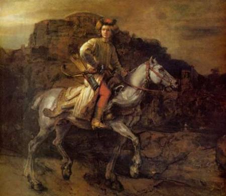 “No one that I know of has as yet trained pigeons to discriminate by style, thought here are fascinating indications that pigeons are easily up to this task. . . . Debra Porter and Allen Neuringer, of Reed College trained pigeons to discriminate between selections from Bach and from Stravinsky. That achieved, they had to decide which of five other composers sounded Stravinsky-like and which Bach-like. Without error, they classed Buxtehude and Scarlatti as Bach-like, Walter Piston and Eliot Carter as Stravinsky-like. They classed Vivaldi however, as Stravinsky-like, leaving it up to us to decide whether they were in error or instructing us in how to think about and listen to Vivaldi. My own feeling at the moment is that I would trust a pigeon more than your standard member of the Rembrandt project on questions of reattribution. I wager The Polish Rider(pictured above) will be returned to the Rembrandt canon if my pigeon colleagues are consulted."
Brillo Box, pgs 28-29.
Ok, so I'm totally sock-knocked-off impressed with pigeons and their remarkable skills and all that, but I'm not sure I trust them to listen to human-made classical music better than humans do. And though the Rembrandt Project has been troublesome in many regards, Danto's insult to their work raises some interesting questions about painting, painters, and viewers. Can a painter eventually be reduced to little more than his style of rendering? What of composition, of subject matter, of materials, of anything, really? Will a computer eventually be able to answer all these unanswered questions, or are pigeons our best hope?
I think they might be for like.com, but I don't know about the rest of it.
03 December 2006
Media and the Real
I’ve just listened to an interesting NPR story about a prisoner at Auschwitz who was assigned to paint watercolor portraits of her fellow prisoners because (according to the Nazi commander there) photographs simply weren’t satisfactorily capturing the degenerate qualities of the gypsies.
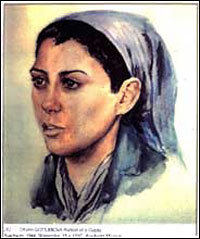 Here is one such image. It was painted by Dina Gottliebova Babbitt, who is now 83 years old and wants ownership of her work. The Auschwitz museum claims ownership of anything that serves as evidence of the place's history.
NPR’s story wasn’t about the merits of photos vs. paintings, but I can't help thinking about that. I’ve been wondering if artists choose to do what they do. My guess is that it is rarely a case where a person weighed the options and chose one medium over the other. More often than not, people go with the medium they happened to learn before they really thought about being an “artist”, be it drawing, photography, or even the new technology-media. There's usually a predisposition. But here, it was a clear choice, and a completely backward seeming one.
Nobody today, except in closed court rooms, would turn to a painting for evidence. Photographs, which make the most credible appeal to reality of any of art’s expressive forms, were thought “not real enough” in this case. It seems like proof enough to me that what the Nazi’s saw in these lesser races was a projection of their inner horrors. Why else would a subjective art, like painting, be seen as more accurate than a documentary photography?
16 December 2005
Viewing art: Originality
From Dictionary.com:
original
1. Preceding all others in time; first.
2. a. Not derived from something else; fresh and unusual: an original play, not an adaptation.
b. Showing a marked departure from previous practice; new: a truly original approach.
3. Productive of new things or new ideas; inventive: an original mind.
It is hard for me to think about contemporary art with out Sherrie Levine's Statement. The whole thing is short enough that I could reproduce it here without making my post longer than usual, but I want to focus on one idea from it. Here's some of the text:
"The world is filled to suffocating. Man has placed his token on every stone. Every word, every image, is leased and mortgaged. We know that a picture is but a space in which a variety of images, none of them original, blend and clash. A picture is a tissue of quotations drawn from the innumerable centers of culture."
I wrote recently about artistic independence, and this post is, I suppose, the other side of that coin. My main point there was that artists refer to, draw on, and borrow from each other and those actions can lead to false conclusions about what an artist (or a non-artist) was or was not doing.
Levine's Statement directs this issue away from artists/viewers and toward the image itself. Images simply are an agglomeration--as she calls it, a tissue of quotations. One thing of value that has come from postmodernism is this realization; that when we speak of originality, we generally are thinking of something much, much smaller than true originality would demand. A representation, any representation, is a re-presentation, a regurgitation of input. Originality of images must operate within this overarching reality, and that means it isn't actually originality.
04 December 2005
Composition #5: Asymmetry
A little while ago I wrote this post about how reading left to right influences our ideas of balance when we look at paintings (sculpture too, but whatever). I got one comment that seems to substantiate my idea that asymmetrical compositions rely on this left-right predisposition to really work.
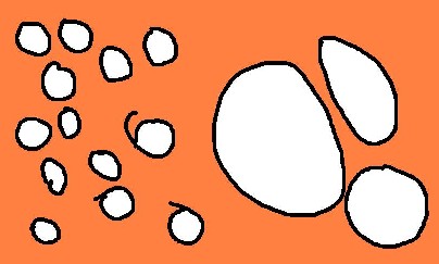
Anyway, there are lots of ways to get asymmetrical balance. You can do it by counter-weighting a few large things on one side with many smaller things on the other. I made the following dinky drawing to show this.
Asymmetry can also work when the objects depicted have sense of direction. For example, if someone is looking off to the right, you can place them off center to the left without making the image look off balance or empty. The viewer assumes that the depicted person’s gaze is going somewhere and that seems to make sense of the space. Here’s one of the few pictures of me you will ever get on this site, so enjoy it.

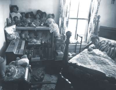
Sometimes asymmetry is deliberately used to allow two or more focal points to compete for interest. Artists can do this to create tension in an image. It makes it more interesting, and adds subtle inflections of meaning. This picture is from Sally Mann’s At Twelve series. The girl and her baby (the subject) are almost crowded out of the frame by all the other things to look at.
02 December 2005
Composition #4: Symmetry
A friend mentioned on my husband’s family-and-friends-only site that a post about symmetry would be welcome. So, in the context of these little ditties about composition, here it is.
Symmetry usually equals instant static balance and boredom. Boring has an undeservedly bad reputation when it comes to composition, because if the image set up is boring, the image content can shine. Warhol’s Marilyn is a good example.

She is smack in the middle, and that keeps your attention on her. If she were slightly off center the image wouldn’t be the same. She would seem much more interesting, alive, in possession of a soul. In the center, she is the object of our gaze, and not much else. That kind of boredom is a great tool for artists to use.
Here’s an older example, Durer’s Apostles. Instead of one figure, there are four evenly spaced, equally large, symmetrically organized people.

Finally, here is my all time favorite symmetry artist. I once saw an exhibition of a whole lot of these in Mannheim, Germany. They are really stunning in real life, and huge too.

This is Victor Vasarely's 1969 oil-on-canvas Vega-Nor.
01 December 2005
Composition #3: Uncomposed
Spell check doesn’t like the word uncomposed, so I’ll just go ahead and take credit for the discovery of a new word. It seems so much more fitting than discomposed, which spell check prefers. Discomposed seems to imply that the thing used to be composed, and is now in a temporary, alternate state. Uncomposed (to me anyway) feels more like intentional, permanent not-composition. That’s what we’re talking about today.
This is by Gustav Courbet, a mid-1800s French realist. This piece is monumental at over three meters high and six meters wide. It is called A Burial at Ornans.
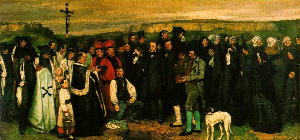
Here’s an interesting summary of the work and its relationship to Courbet’s career.
Anyway, here you have none of the intentional lead-the-eye-through-the painting devices that were customary in French painting at the time A Burial at Ornans was painted. The people are just there rather like they would be in real life. Furthermore, like shap shots that you’ve got in your own collection, people are cut off, the dog’s feet are missing, and most of the people in the image aren’t paying attention or are looking away.
If I were a painter, it would take a lot of effort to choose not to correct life’s little imperfections. That’s actually one of the things that is kind of magical about art. You can create something that strongly reminds the viewer of their visual world even if it is totally contrived and divorced from it.
Uncomposition isn’t restricted to representational painting either. There are examples of it all over, but here’s a famous one:

That’s Jackson Pollock in an action shot of his action paintings. There is no center, no sense of dominance, foreground, background, focal point, light shadow, etc. Not there. Like Courbet's, this image isn’t about clever artistic composition.
30 November 2005
Composition #2: Dynamic
Continuing the theme I started yesterday, the topic today is based on one compositional form. We’ve already discussed static composition and the ways stability can be brought into an image. I listed some of the drawbacks to that form, specifically that it is a bit too stable.
Today I’ve got an example of dynamic composition, and though there are plenty of paitings that are dynamically composed, the example today comes from sculpture. And lest you think that dynamic composition is only found in modern works of art, I’ll go ahead and negate that. Dynamic and static are not like new and old or like good and bad. They are simply two different methods of achieving balance.

This is Henry Moore’s Internal and External Forms, a bronze held in the Kunsthalle Mannheim. Unlike the example yesterday that had a specific sense of focal point, Moore’s sculpture doesn’t. To me, the piece looks cyclical. The eye travels from the top left diagonally down to the right, and back through the forms toward the top left. Along this path there are undulations, pits, shadows, layers, and many curves that catch the eye and impeded its progress back toward the top left reach. These impediments disrupt our sense of the overall composition (triangular like the figure groupings in Horatii).
One drawback to dynamic composition is that there isn’t a strong focal point, and sometimes a strong focal point is what’s needed.
Principles of static and dynamic composition form the foundation for the next two discussions. I can’t wait.
29 November 2005
Composition #1: Static
Today, I’m starting a short series about basic principles of composition that show up in the visual arts. I started thinking about these principles after seeing Kat's portfolio. The first installment is on the form used most often in classicism, be it painting, sculpture, or architecture. You'll find it elsewhere too, just in case you were wondering.

This is Oath of the Horatii, from 1784 by Jaques-Louis David, one of the foremost painters of the French Neo-Classical academic style. What you see is a dramatic scene, the moment when the Horatii brothers enter into an oath to fight. Opposite them, the women are already weeping for the loss of their husbands. For all the action going on in the depiction, all the dramatic light, all the force of gesture, and so on, the piece remains entirely static.
Why is that? Well, here are some lines that I’ve drawn in to illustrate the compositional devices that are specifically designed to give stability and “weight” to the image.

The background is BORING, and deliberately so. No one’s attention is getting lost back there. It’s black and uninteresting, pushing the eye back to the people in the foreground. The three arches in the dark divide the image in to three sections, and each of those three sections has a stable, bottom-weighted triangle within it. The center triangle is done most cleverly, with the swords and forearm grasping them continuing the perspective lines of the floor. The central figure’s legs are nearly parallel to these lines as well, which reinforces the viewer’s perception of his stability.
Static composition is pretty easy to achieve with triangles like this, because it is pretty hard to throw a pyramid or a tri-pod off balance. The drawback to composition of this style is that it isn’t very exciting. The images looks lifeless despite the phenomenally lifelike rendering, because real life isn’t that balanced.
Stay tuned for dynamic composition tomorrow.
13 November 2005
Mirror, mirror
One year ago today, Matthew and I arrived in Beirut. We are older and wiser than we were then, but we still have lessons to learn. One of them reminded me of an art history lecture from my undergrad days. We were talking about composition, and the way the western artist’s sense of it changed when they saw the Japanese way of representing space. Van Gogh’s 1888 Night Cafe is a good example of some of the changes.
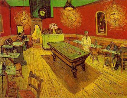
See how the floorboards are raked upward as they recede? That kind of angle was a very new thing in a Europe that still couldn’t quite let go of Renaissance perspective. But perspective wasn’t the only element of composition that changed. Even though the Night Cafe might seem pretty simple, it is actually a very complicated. Lets see if I can show you what I mean. Focus your attention on the bottom right hand corner of the image. Nothing there. Now look at the bottom left corner, which is rather cluttered with chairs and tables going every which way. These chairs are closest to the viewer. The pool table in the center is about as far back as the people sitting on the extreme right. So, how is it that the big empty foreground on the right and the crowded, complicated foreground on the left don’t look lopsided? Shouldn’t it? Shouldn’t it seem awfully unstable? Maybe it should, but for me it doesn’t. Somehow it works. That somehow is at the heart of today’s post.
My guess is that there are definitely people out there who would look at Night Cafe and feel like the picture was totally off kilter. I would further guess that if your most comfortable written language is read from right-to-left, you would have more trouble with this image that I do, being a native left- to-right reader. Here’s a simple overview of how looking goes: I see the cluster of chairs on the left first, and keep “reading” to the right, where there is nothing, and my eye comes to a rest in the middle on the pool table. But what about someone who approaches their visual world from the right, moving to the left? I imagine that they start with the big empty space on the right, and move right over to the left and get stuck in the gaggle of chairs.
To give you left-to-right readers an idea of what I think Night Cafe is like for right-to-left readers, here’s a mirror image of Night Cafe.

You are now up against the difficulties a right-to-left brain would have. I don’t know about you, but I feel like the reverse image is terribly off balance. Maybe a primarily Arabic, Chinese, or Japanese reader out there can tell me which Night Cafe they prefer.
11 November 2005
Viewing Art: Representation
This post is an extension of some ideas I discussed in relation to Russian Icons on Sunday. The purpose of that post was to show that some kinds of depiction, however detached from the subject matter, purpose of the image, or outside world they may be, never change.
I'm guessing that most of the people who read this are as outside the Russian Icon thing as I am. With that in mind, I went to Microsoft Paint and made the following image:
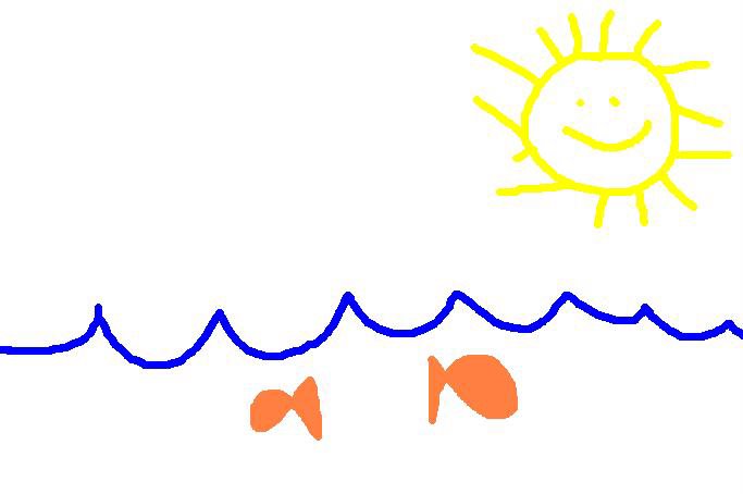
I do hope that you all can relate to this image. We see the open sea on a clear sunny day. Below the rippling surface of the water we see two fish merrily going their separate ways.
For you reading this post, the representational conventions in my drawing ought to come right out of the lexicon of familiar images. But why? How is it that the scalloped blue line has come to represent water? I have never, ever seen water do that. Furthermore, I had not seen blue water until I was an adult. But I had been drawing blue scalloped water from the beginning. Why then, in the absence of actual water of that color and texture do I see the blue scalloped line and I think "water"? It is a very clever symbol perhaps, but not a depiction. The same is true of the Sun. I've also never seen little sunbeams darting out from the sun's edges, and I've never seen the sun smile. But all the same, when we look at these two representations we don't think "how strange". We think "sun" and "water".
Conventional representation happens a lot in cartoons, which is also a good place to find conventional music. If I had to think of a musical piece as stuck representation-wise as the blue scalloped line, I'd list Edvart Grieg's Peer Gynt Suites. A pastoral morning in a cartoon isn't complete without his "Morning Mood". If you aren't sure you know which piece I'm talking about, Amazon will let you listen. (you have to scroll down)
09 November 2005
Viewing Art, 1860's style
Nathaniel Hawthorne is probably best known for The Scarlet Letter, but he also wrote The Marble Fawn, which provides some insight into what it was to be an American and an artist before modernism began fomenting change.
Midway through the second chapter of that book, three Americans (Kenyon a sculptor, Hilda and Miriam, painters) are discussing some of the antiquities in the Capitoline Museum. Kenyon is speaking about the Dying Gaul:
"I used to admire this statue exceedingly," he remarked, "but, latterly, I find myself getting weary and annoyed that the man should be such a length of time leaning on his arm in the very act of death. If he is so terribly hurt, why does he not sink down and die without further ado? Flitting moments, imminent emergencies, imperceptible intervals between two breaths, ought not to be incrusted with the eternal repose of marble, in any sculptural subject, there should be a moral standstill, since there must of necessity be a physical one. Otherwise, it is like flinging a block of marble up into the air, and, by some trick of enchantment, causing it to stick there. You feel that it ought to come down, and are dissatisfied that it does not obey the natural law."
"I see," said Miriam, mischievously, "you think that sculpture should be a sort of fossilizing process. But, in truth, your frozen art has nothing like the scope and freedom of Hilda's and mine. In painting there is no similar objection to the representation of brief snatches of time; perhaps, because a story can be so much more fully told in picture, and buttressed about with circumstances that give it an epoch. For instance, a painter never would have sent down yonder Faun out of his far antiquity, lonely and desolate, with no companion to keep his simple heart warm."
"Ah, the Faun!" cried Hilda, with a little gesture of impatience; "I have been looking at him too long; and now, instead of a beautiful statue, immortally young, I see only a corroded and discolored stone. This change is very apt to occur in statues."
"And a similar one in pictures, surely," retorted the sculptor. "It is the spectator's mood that transfigures the Transfiguration itself. I defy any painter to move and elevate me without my own consent and assistance."
"Then you are deficient of a sense," said Miriam.
--
There are conversations like that throughout the novel. The ideas are now almost 150 years old and the focus of the debates over the nature, capacity, strengths/weaknesses of sculpture and painting have changed. Kenyon's statement of the viewer's importance "I defy any painter . . . " is remarkably apt. Today we are very likely to adopt a to-each-his-own view of art, but that one of Hawthorne's characters acknowledges the importance of the viewer is remarkable even if Miriam thinks he's hadicapped for it.
04 November 2005
Viewing Art: Objectivity
Happy sixth anniversary to me, and to my husband.
Looking at art is actually a rather complicated thing. The more you know about art and its history, or about the artist, or about art criticism, or the confluence of art and society, the more complicated it becomes. Well, in view of the heaps and mounds of stuff to consider, some began advocating that what art viewers needed most was an "innocent eye". Art, they believed, ought to be judged independent of all of the art world's history, baggage, and implications.
But let’s think about that for a moment. Is that wish even possible? Can anyone with the gift of two eyes and a brain connected to them refrain from making judgments based on what they have already seen? Furthermore, can anyone who has read anything about art just completely NOT think about those things when something in the visual world recalls them?
Consider the following painting in that context.
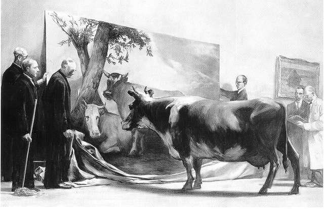
This is The Innocent Eye Test by Mark Tansey, 1981. It is a very clever piece and volumes could be and have been written about it. What you are looking at is a cow, brought into the gallery to test Paulus Potter's image called Young Bull, a classic, naturalistic painting from 1647. Tansey has also painted in some art-types standing there like so many suits. In the background, you may be able to identify one of Monet's haystacks.
Tansey's painting depicts the moment when the museum-folk have let the drapery fall. They (and we viewers) await the judgment of the cow. If the cow is convinced that she is seeing a hot young bull, then we will have our answer. Finally, we will know if Paulus Potter was any good. After all, the cow's judgment couldn't possibly be anything but innocent.
Do we want that? Certainly, the art's baggage is a cumbersome and difficult thing. But without it, we are as ignorant as the cow and not nearly so innocent.
20 October 2005
The difference between Looking and Reading
Here's a fun little exercise. Time yourself as you say the names out loud of each of the colors in the table below.
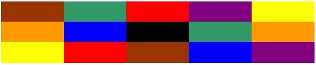
Now try a similar exercise. This time, there aren't blocks, but words. Don't read the word, but say the name of the color of the letters. Time yourself for this one as well.

If you are pretty good at English, it will probably take you much longer to do the second set than the first. Why is that? Well, it takes a lot of effort for the brain to suppress the inclination to read. As you go through the second set you have to keep shutting that tendency out.
I'd be interested to know if the same thing is true of pictographic languages, but I'd guess that it is.
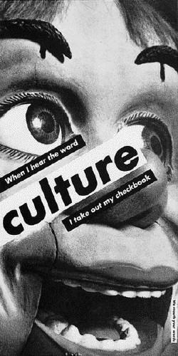
Anyway, there's always a bit of a problem of priority when images are mixed with words. In the past, the title was used to clarify the image, or direct the viewer's attention to a certain aspect of it. The potential for tension between title and image caused some artists to choose not to name their pieces at all. Other artists have chosen to exaggerate the situation by mixing images and text. The following is a good example of this: When I hear the word Culture by Barbara Kruger, 1985.
Subscribe to:
Posts (Atom)
