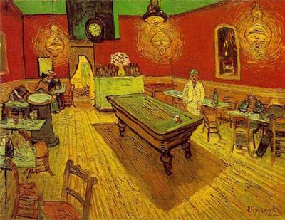
One year ago today, Matthew and I arrived in Beirut. We are older and wiser than we were then, but we still have lessons to learn. One of them reminded me of an art history lecture from my undergrad days. We were talking about composition, and the way the western artist’s sense of it changed when they saw the Japanese way of representing space. Van Gogh’s 1888 Night Cafe is a good example of some of the changes.

See how the floorboards are raked upward as they recede? That kind of angle was a very new thing in a Europe that still couldn’t quite let go of Renaissance perspective. But perspective wasn’t the only element of composition that changed. Even though the Night Cafe might seem pretty simple, it is actually a very complicated. Lets see if I can show you what I mean. Focus your attention on the bottom right hand corner of the image. Nothing there. Now look at the bottom left corner, which is rather cluttered with chairs and tables going every which way. These chairs are closest to the viewer. The pool table in the center is about as far back as the people sitting on the extreme right. So, how is it that the big empty foreground on the right and the crowded, complicated foreground on the left don’t look lopsided? Shouldn’t it? Shouldn’t it seem awfully unstable? Maybe it should, but for me it doesn’t. Somehow it works. That somehow is at the heart of today’s post.
My guess is that there are definitely people out there who would look at Night Cafe and feel like the picture was totally off kilter. I would further guess that if your most comfortable written language is read from right-to-left, you would have more trouble with this image that I do, being a native left- to-right reader. Here’s a simple overview of how looking goes: I see the cluster of chairs on the left first, and keep “reading” to the right, where there is nothing, and my eye comes to a rest in the middle on the pool table. But what about someone who approaches their visual world from the right, moving to the left? I imagine that they start with the big empty space on the right, and move right over to the left and get stuck in the gaggle of chairs.
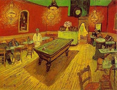
To give you left-to-right readers an idea of what I think Night Cafe is like for right-to-left readers, here’s a mirror image of Night Cafe.

You are now up against the difficulties a right-to-left brain would have. I don’t know about you, but I feel like the reverse image is terribly off balance. Maybe a primarily Arabic, Chinese, or Japanese reader out there can tell me which Night Cafe they prefer.

2 comments:
Hi Mary Ann!
I came across your blog from Matthew's. I just wanted to say that I prefer the reverse image of Van Gogh's original (Although most of Van Gogh's art gives me a sense of discomfort).
To me the reverse image doesn't seem as cluttered as the original and the lines slanting to the right in the reverse image is more preferable. But since I'm generally illiterate in Japanese, I would have predicted the opposite.
Another interesting article I read about cultural perspectives, if you're interested:
How Culture Molds Habits of Thought (http://www.nytimes.com/library/national/science/health/080800hth-behavior-culture.html)
The same researcher also authored a book called The Geography of Thought: Why We Think the Way We Do (http://www.amazon.com/exec/obidos/tg/detail/-/0743216466/002-2750553-5169607?v=glance)
--rei
Thanks Rei--I'll have to check out those links.
One thing that I didn't deal with in the post is the intetional unease that painters can create with composition--it could be that Van Gogh wanted that result with the tenuous balance in this image. After all, he was a kind of zealot, and quite likely didn't approve of those hanginag out in the Night Cafe.
Post a Comment