A little while ago I wrote this post about how reading left to right influences our ideas of balance when we look at paintings (sculpture too, but whatever). I got one comment that seems to substantiate my idea that asymmetrical compositions rely on this left-right predisposition to really work.
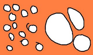
Anyway, there are lots of ways to get asymmetrical balance. You can do it by counter-weighting a few large things on one side with many smaller things on the other. I made the following dinky drawing to show this.

Asymmetry can also work when the objects depicted have sense of direction. For example, if someone is looking off to the right, you can place them off center to the left without making the image look off balance or empty. The viewer assumes that the depicted person’s gaze is going somewhere and that seems to make sense of the space. Here’s one of the few pictures of me you will ever get on this site, so enjoy it.

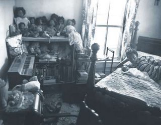
Sometimes asymmetry is deliberately used to allow two or more focal points to compete for interest. Artists can do this to create tension in an image. It makes it more interesting, and adds subtle inflections of meaning. This picture is from Sally Mann’s At Twelve series. The girl and her baby (the subject) are almost crowded out of the frame by all the other things to look at.


4 comments:
What about our screwed up lebanese brains that read from both right to left and left to right? ;)
I'd love to know what you think of it, actually. For me (obviously a left-right reader) force of sight and therefor action only happens from left to right, which I think is a function of reading. Cinematographers use this predisposition all the time to lead viewers through a shot. Advertisers use it too when it comes to showing cause and effect, before and after, etc.
I've seen some examples in Lebanon of arabic advertisements going the other way (right to left = before and after), which really throws me.
i really like this one (asymmetry). so much more 'real life' than stylized symmetry. i once instructed a class of high school kids, "list some geometric shapes found in nature." it was a trick question, since, to my knowledge, real triangles, circles, and squares don't exist in nature. the mann photo looks like a moment of real life.
You know, I think it is interesting that the left to right reading is true for art. I am taking an Intro to Film class and my teacher says that the right side of the screen is stronger for film. I think that is true as well. I wonder why there is a difference.
Post a Comment