skip to main |
skip to sidebar
Ah music--to artists 150 years ago, music was synonymous with freedom. It was their ticket out of representationalism and into the hitherto unexplored realms of abstraction.
 This James Abbot McNeil Whistler's Symphony in White No. 1: The White Girl from 1861-62.
The title is taken from music, and so is the apparent lack of subject matter. Sure, there's a girl there, but she is white, white dress, white background and forgound, white, white, white. It isn't about her. It's about the color. Whistler would get far more abstract than this, but even his most daring Falling Rocket is only a partial abstraction.
So time goes by and things change. About fifty years after Whistler's image, Wassily Kandinsky took music as the ideal for the visual arts. He theorized and wrote about the confluence of music and color and painting, and started naming his paintings the way musicians name their compositions: improvisation, composition, contrasting sounds, etc. By the time we get to Kandinsky Modernism is in full swing. Cubism has already evolved through its first two phases, and the influence of academic "correct" painting had fallen considerably.
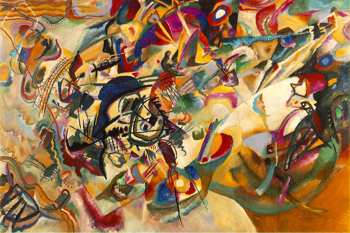 This is one of his 1913 compositions (number seven for those of you who care. And incidentally, the numbering thing also derives from music (think of all the numbered classical compositions out there). Kandinsky was able to take the influence of music further than Whistler ever had. Music is a far more overt inspiration and starting point for these later works.
Once again, time goes by and things change. Another fifty years pass. 100 years after Whistler's Symphony in White, Clement Greenberg wrote:
". . . the unique and proper area of competence of each art coincided with all that was unique to the nature of its medium. The task of self-criticism became to eliminate from the effects of each art any and every effect that might conceivably be borrowed from or by the medium of any other art. Thereby each art would be rendered 'pure' and in its 'purity' find the guarantee of its standards of quality as well as of its independence."
In other words, painting should not try to imitate music, and sculpture should not try to imitate literature, and music and literature should not try to imitate painting or sculpture. This was Greenberg's attempt to put some rules into an art world that, already in 1960, was all wrong.
Conceptual Art really makes a lot of people mad. I think it makes them mad because it actually makes them feel stupid, and people don't like to feel stupid especially when it is an inanimate "dumb" object that makes them feel that way, so instead they get angry.
A bit of history seems called for. Conceptual Art is now a rather old thing as far as contemporary art goes. It has come and gone (I think). By the early 1970s, Conceptual art was already a well developed thing and one the wane.
In 1969, Sol LeWitt wrote 35 'Sentences on Conceptual Art'. Here are some of the highlights:
5. Irrational thoughts should be followed absolutely and logically.
10. Ideas alone can be works of art; they are in a chain of development that may eventually find some form. All ideas nee not be made physical.
13. A work of art may be understood as a conductor for the artist's mind to the viewer’s. But it may never reach the viewer, or it may never leave the artist's mind.
18. One usually understand the art of the past by applying the conventions of the present thus misunderstanding the art of the past.
24. Perception in subjective.
32. Banal ideas cannot be rescued by beautiful execution.
33. It is difficult to bungle a good idea.
35. These sentences comment on art, but are not art.
So conceptual artists did a lot of this kind of thing:

This is Joseph Kosuth's 1966 Titled (Art as Idea as Idea) [Water]. Conceptual Art on its own, isolated from the events that preceded and surrounded it, really does make you shake your head. But I think it makes sense and even seems pretty normal considering what was going on at the time. I think these artists and the industries that allowed them to function were sick of the avant-garde hero demi-god role that artists had been playing. There was a huge disillusionment in that cult and in the ideas of authenticity, originality, progress, and so on. Modernism was failing and with that failure looming, Conceptual Art seems to have been a coping mechanism.
People argue that stuff like this is more than an empty threat to the sanctity of art. They argue that it does actual harm to it. I can't say I agree with that. As I see it Conceptual Art elicits two reactions.
1. People see it, furrow their brow, scratch their head, move on.
2. People see it, hate it, revolt against it, dig their heels in opposite it.
In either case, the viewer walks away from Conceptual works with ideas about art. Either their idea has evolved or it hasn't. I doubt that matters. But whatever their thoughts about art may be, they've got 'em, and conceptual art got them thinking.
So yesterday I made a case for art and not art rather than good and bad art. I need one more disclaimer on it. There are all these areas where art is used as a descriptor on a specific category of creation: media arts, arts and crafts, folk art, decorative art, etc. My previous post wasn’t intended to castigate or condone any of these art derivations/deviations/divisions. They exist in their own right apart and outside of the art I wrote about yesterday.
And that brings me to Government Art, which is one of those categories outside the scope of art as described yesterday. I’ll just come right out and say that most of what governments make to present themselves to the world stinks. It isn’t art. Government Art is only called that because that’s what they claim it is. Most of the art in this category is an oxymoron like “honest politician”, but there are a few notable exceptions.
We aren’t talking about the exceptions today though. We are talking about the rule.
The first example is from the US Capitol building, which, thank goodness, wasn’t even mentioned in any of the art classes I have ever taken. Nothing from the US Capitol is in any of my art books either. If you click here you’ll find an image of the statuary on the pediment of the Senate entrance. All classically rendered, proportional etc., I can’t really object to the looks of it except to say that it is fairly blah. But look at what is depicted. The following is a statement from the US government’s site about this statuary:
The sculptural pediment over the Senate entrance on the U.S. Capitol's east front is called Progress of Civilization. The center figure is America, who stands with an eagle at her side and the sun at her back. On the right, a woodsman, hunter, Indian chief, Indian mother and child, and Indian grave represent the early days of America. On the left the diversity of human endeavor is suggested by the soldier, the merchant, the two youths, the schoolmaster and child, and the mechanic. Completing this side of the tympanum are sheaves of wheat, symbolic of fertility, and an anchor, symbolic of hope; these elements are in contrast with the grave at the opposite end of the tympanum.
What a load of propaganda. But that’s what Government Art generally is, and luckily, most of it is so devoid of educational value that nobody is taught about it. At least, art students aren’t. I frankly think that the sculpture should be taken down.
On a different, but equally bad note, Bosnia has recently added this to their collection of state art. Government Art (with only a few exceptions) is a travesty.
Good and bad are dangerous terms almost everywhere and especially in art. The first, most obvious reason is that taste changes. We get sick of the same old same old beautiful (or meaningful or moving or inspiring or whatever you want art to be) stuff and find that we need something new. This has been going on for millennia, and everything about modern life seems to support the idea that this (if not a whole lot else) will continue to be as it has been in the past.
The second reason why the terms good and bad are dangerous for art is that they set up a specific operational structure under which art must labor. If there was such a thing as "good" art it would presuppose both the existence of "bad" art and specific criteria by which that distinction had been reached ("this art is good because x, y, & z"). That set of criteria would only be useful if it applied to all art everywhere for all time. For the reason why such criteria are impossible to identify, reread the first, most obvious reason. I wish to argue here that there is no such thing as good art and bad art—there is only art and not art. Either it is or isn’t. There are no varying degrees of art-being. It’s all or nothing here, and therefore "good"” is meaningless. Think of it like this: an organism is a human being or it isn’t. There are no "kinda-sorta" humans.
Please don’t take this further than what I have just outlined. A Monet is usually a good example of Impressionism, and a Warhol is always a bad example of Neo-classicism, and so on. Specific works of art can be good or bad illustration of specific things, but that has nothing to do with being good or bad art. Also, I think it is fair for individuals to decide what for them is good or bad art, acknowledging that these assessments fail to be universally applicable.
I thought I would share a bit of what I think is architectural perfection.
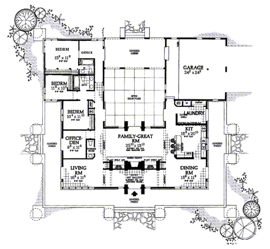
Several years ago I came across a floor plan that I really liked. Really, really liked. I liked it so much that I saved a copy of it on my computer and labeled it "dream house".
The original wasn't perfect, so I started making changes. Just minor things, like adding a wall so that the kitchen isn't soooo huge (which magically added a laundry room at the same time). So here it is:
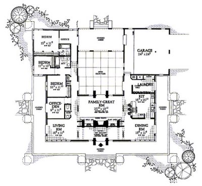
Here is a list of things I think are good about it:
1. The garage is not visible from the front of the house, but it is located close to the kitchen (good for hauling in groceries).
2. The bedrooms are closely grouped (which means I wouldn’t have to walk through the entire house to comfort a crying child in the dead of night).
3. The entryway doubles as an art gallery, and doesn’t open directly into living spaces.
4. I like the internal courtyard.
5. The house is symmetrical, which appeals to my sense of design and proportion.
6. It is a single story house, which means that I could grow old in it—no stairs to negotiate.
7. It is not too big for me to keep clean on my own. (Well maybe it is too big. I don't know about that anymore.)
8. There are enough bedrooms for all the kids I could ever hope to have, and plenty of room for grandkids or otherwise guests.
9. I really like the large porch area all around the front and sides. It seems perfect for a summer evening.
The mid-westerner in me really would like to see a basement added to this house, and that can be done fairly easily, I think, just by adding a staircase somewhere, from the garage perhaps.
There are a few, more fundamental problems with my dream though. Like the fact that I prefer to live in cities where a home like this would be prohibitively expensive, that I detest the "have to drive everywhere" culture of the US that a house like this would impose on me, or that I am too security minded to actually have a home with so many doors to the outside.
So the question is, is this house actually perfect? Is it only perfect if it can be put into practice?
Happy Birthday Megan.
Five and a half years ago, Megan wasn't married, didn't blog, didn't have a cute little girl in her life, and about a million other things that are different these days. Matthew and I were Newlyweds (really?) and she came to visit for a week, probably around spring break.
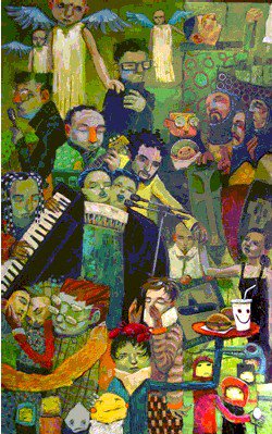
While she was there, I showed her some work by Aaron Jasinski, an artist who at that time was in the same place we were. I had seen some of his paintings and liked them. I even contacted him about buying one (but the one I wanted wasn't available. *sigh*). He's got a catchy name that was easy not to forget, so over the last five or six years I've been watching him. His web site has gotten better and better. You should check it out (click on his name up there).
Anyway, there was one painting in particular that Megan liked a lot, and I can't find it anymore. It had a princess on a horse, and a knight in shining armor kneeling before her and offering a flower. In the absence of that one, I found this one that I think represents the artist's style. It is called Devoted Ambitions from 2004. There is something perfectly happy about each of his paintings, and I wish I had a more academic way to phrase that, but since I don't, there it is. Happy. One of these years, I really want to buy an original because I think I need more happy things in my life and in my art collection.
Anyway, I hope you have a great birthday, Megan.
If the phrase "textile art" makes you think of this please keep reading. Your horizons are about to expand.
Art and textiles have a long history together. "Oil on Canvas", for example, is such a common thing to read in a museum that it may seem to loose its meaning. Just so you know, oil doesn’t always go on canvas. Sometimes it is oil on something else. Not being a painter myself, I have to guess about why an artist would choose canvas over a smooth board. Maybe the texture of the canvas is desirable in some way. Maybe an artist out there can tell me.
Anyway, the canvas is not the star of the painting show, the oil is. Canvas for hundreds of years was concurrently indispensable and invisible, like the backstage crew at the theater. Then, about a hundred years ago, artists started leaving bits of canvas untouched. You might think to call the painting unfinished, but it was finished. Intentional blank spots. Little bits of canvas peeking through the paint, present in a way it hadn’t been for as long as it had been.
The idea of liberating canvas got taken a lot further in the 1960s. Eva Hess made a really great piece of art that has been written and theorized about, perhaps endlessly. It was made in 1966, and is called Hang Up.
 What you see is a frame, wrapped in pieces of canvas that have been dipped in paint. The wire protruding from it falls out into the space in front of it. It both hangs and drags, an interesting combination. I think it is brilliant, and I’ll try to give a few reasons why.
First, it isn’t comfortably either painting or sculpture and back in the mid 1960s, that was a big deal. It was one of fine art’s "hang-ups". The distinction between the two and the requirements of each was a big messy problem. This piece is a perfect illustration of what some people thought was completely wrong with art, and others thought was completely right. Can sculpture hang on the wall? Can painting flop on the floor?
Second, the canvas and paint are there, but they are wrapped around the frame, which this time, isn’t around anything. The frame is the point of interest because there is a void within it. Again, this raised questions about the nature of painting. Can a painting be empty? Can a painting be not-painted?
What started out as a bit of freedom for the canvas, paint, and painter grew into this piece that puts so many questions to the viewer about materials and art. So anyway, next time you see a painting, ask yourself what it was painted on. It might make a difference.
I thought those of you out there who like art but haven’t really studied art history would appreciate an overview of art history methodologies. Methodology is a big word, and in this context it means “approach”. These are the most common ways that scholars look at and judge art. They are not all compatible, and some are mutually exclusive. Each will lead you to a very different appraisal of any given work. To illustrate, I’ve chosen Daumier’s Third Class Carriage from 1865. You can refer back to it for each of the methodologies below.
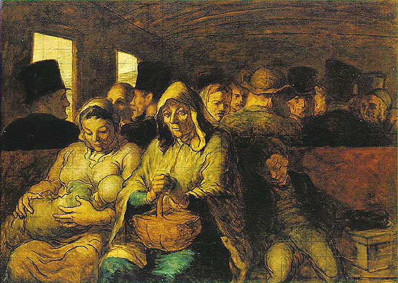
Formalistic—This approach might seems inappropriate unless the art in question is one of total abstraction, but it yields interesting content anyway. The color, line, value, and composition are the only things a formalistic reading concerns itself with. You’d note the heavy outlines, the subdued tones, the crowded composition. All of this would then feed into one of the other approaches, which would help create an interpretation of those formalistic elements.
Psycho-analytic—Typically, this methodology focuses on the artist and how their work illustrates their various psychoses. Using it with the Daumier above, you’d want to also investigate the psychologies of the people he depicts, and if these depictions are in any way autobiographical. Freud’s ideas are usually at the center of these writings. It doesn’t seem to matter that Freud got a lot wrong, so I’m not really fond of this methodology.
Socio-historical—This methodology is concerned with what was it like to be an artist, to be a viewer, and the condition of art at the time it was done. Was it common to depict scenes like this? Who was the intended audience? Is the artist moralizing, glorifying, condemning anyone?
Feminist—The feminist methodology is like the socio-historical, but woman-centric. Relevant questions include, “what was the condition of women at the time the art was done?”, “what was it like to be a woman artist?”, “what was it like to be a woman viewer?”, “whose gaze is it, a man’s or a woman’s?” Daumier wasn’t a woman, but that doesn’t mean his works are outside the scope of this methodology.
Marxism/class—Not too different from the feminist critique, the Marxist approach centers on class, status, money, power, and so on. Relevant questions include, “who were the viewers?”, “who were the artists?”, “what was their status?”, “how is status depicted?” It makes a difference if Daumier was on a level with the occupants of the third class section, or if he depicts them as a voyeur with a better seat.
Iconography—This one is tricky, because there are times when a rock or an apple or a sailboat is only that and nothing more. Other time, depicted objects, placement of people, gestures, and other visual devices carry symbolic weight that is necessary to understand the intended message of a piece. I don’t have any idea if a symbolic reading of Daumier’s work has been done or if anything came of it if it has been.
Semiotics-- This has to do with visual culture and how a piece of it relates to the whole. The fact that we look at Daumier’s heavy black outlines and we think of cartoons is relevant here. This approach is concerned with what images mean and why they mean them. So if you find Daumier’s painting a bit, well, depressing, this approach is all about figuring out why it seems that way.
So why does this qualify as one of Art History's problematic situations? Well, there are at least seven ways to look at any work of art, yielding seven potentially mutually exclusive interpretations. This really only works if you already believe that art is something different for each viewer out there.
A friend mentioned on my husband’s family-and-friends-only site that a post about symmetry would be welcome. So, in the context of these little ditties about composition, here it is.
Symmetry usually equals instant static balance and boredom. Boring has an undeservedly bad reputation when it comes to composition, because if the image set up is boring, the image content can shine. Warhol’s Marilyn is a good example.

She is smack in the middle, and that keeps your attention on her. If she were slightly off center the image wouldn’t be the same. She would seem much more interesting, alive, in possession of a soul. In the center, she is the object of our gaze, and not much else. That kind of boredom is a great tool for artists to use.
Here’s an older example, Durer’s Apostles. Instead of one figure, there are four evenly spaced, equally large, symmetrically organized people.

Finally, here is my all time favorite symmetry artist. I once saw an exhibition of a whole lot of these in Mannheim, Germany. They are really stunning in real life, and huge too.

This is Victor Vasarely's 1969 oil-on-canvas Vega-Nor.
Spell check doesn’t like the word uncomposed, so I’ll just go ahead and take credit for the discovery of a new word. It seems so much more fitting than discomposed, which spell check prefers. Discomposed seems to imply that the thing used to be composed, and is now in a temporary, alternate state. Uncomposed (to me anyway) feels more like intentional, permanent not-composition. That’s what we’re talking about today.
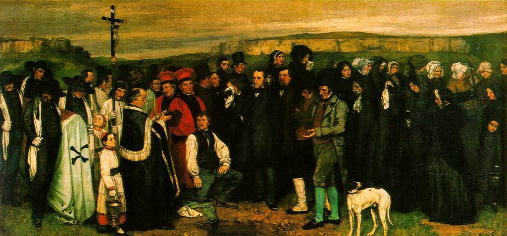
This is by Gustav Courbet, a mid-1800s French realist. This piece is monumental at over three meters high and six meters wide. It is called A Burial at Ornans.
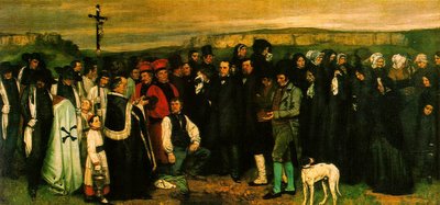
Here’s an interesting summary of the work and its relationship to Courbet’s career.
Anyway, here you have none of the intentional lead-the-eye-through-the painting devices that were customary in French painting at the time A Burial at Ornans was painted. The people are just there rather like they would be in real life. Furthermore, like shap shots that you’ve got in your own collection, people are cut off, the dog’s feet are missing, and most of the people in the image aren’t paying attention or are looking away.
If I were a painter, it would take a lot of effort to choose not to correct life’s little imperfections. That’s actually one of the things that is kind of magical about art. You can create something that strongly reminds the viewer of their visual world even if it is totally contrived and divorced from it.
Uncomposition isn’t restricted to representational painting either. There are examples of it all over, but here’s a famous one:

That’s Jackson Pollock in an action shot of his action paintings. There is no center, no sense of dominance, foreground, background, focal point, light shadow, etc. Not there. Like Courbet's, this image isn’t about clever artistic composition.
Continuing the theme I started yesterday, the topic today is based on one compositional form. We’ve already discussed static composition and the ways stability can be brought into an image. I listed some of the drawbacks to that form, specifically that it is a bit too stable.
Today I’ve got an example of dynamic composition, and though there are plenty of paitings that are dynamically composed, the example today comes from sculpture. And lest you think that dynamic composition is only found in modern works of art, I’ll go ahead and negate that. Dynamic and static are not like new and old or like good and bad. They are simply two different methods of achieving balance.
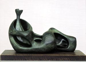
This is Henry Moore’s Internal and External Forms, a bronze held in the Kunsthalle Mannheim. Unlike the example yesterday that had a specific sense of focal point, Moore’s sculpture doesn’t. To me, the piece looks cyclical. The eye travels from the top left diagonally down to the right, and back through the forms toward the top left. Along this path there are undulations, pits, shadows, layers, and many curves that catch the eye and impeded its progress back toward the top left reach. These impediments disrupt our sense of the overall composition (triangular like the figure groupings in Horatii).
One drawback to dynamic composition is that there isn’t a strong focal point, and sometimes a strong focal point is what’s needed.
Principles of static and dynamic composition form the foundation for the next two discussions. I can’t wait.
Today, I’m starting a short series about basic principles of composition that show up in the visual arts. I started thinking about these principles after seeing Kat's portfolio. The first installment is on the form used most often in classicism, be it painting, sculpture, or architecture. You'll find it elsewhere too, just in case you were wondering.
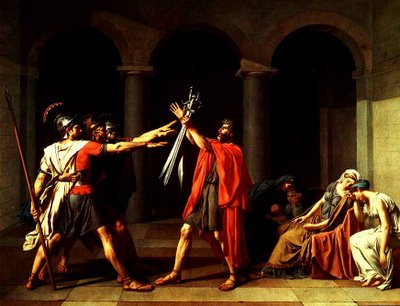
This is Oath of the Horatii, from 1784 by Jaques-Louis David, one of the foremost painters of the French Neo-Classical academic style. What you see is a dramatic scene, the moment when the Horatii brothers enter into an oath to fight. Opposite them, the women are already weeping for the loss of their husbands. For all the action going on in the depiction, all the dramatic light, all the force of gesture, and so on, the piece remains entirely static.
Why is that? Well, here are some lines that I’ve drawn in to illustrate the compositional devices that are specifically designed to give stability and “weight” to the image.
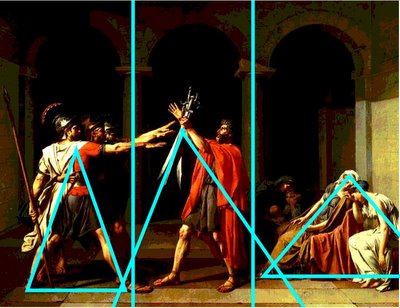
The background is BORING, and deliberately so. No one’s attention is getting lost back there. It’s black and uninteresting, pushing the eye back to the people in the foreground. The three arches in the dark divide the image in to three sections, and each of those three sections has a stable, bottom-weighted triangle within it. The center triangle is done most cleverly, with the swords and forearm grasping them continuing the perspective lines of the floor. The central figure’s legs are nearly parallel to these lines as well, which reinforces the viewer’s perception of his stability.
Static composition is pretty easy to achieve with triangles like this, because it is pretty hard to throw a pyramid or a tri-pod off balance. The drawback to composition of this style is that it isn’t very exciting. The images looks lifeless despite the phenomenally lifelike rendering, because real life isn’t that balanced.
Stay tuned for dynamic composition tomorrow.
A while ago I wrote a tiny, pathetic post about art crime, which did little more than list the resources out there for recovering art that has been stolen, looted, or lost.
That post is not to be confused with today’s post about art that is against the law.
As it turns out, there are lots of ways that artists can get themselves into trouble. The one that I’m thinking of today has to do with copyright infringements. There’s a site called illegal-art.org that has made it their business to publicize these events. They’ve even got pictures of the illegal art, and have information about a lot of illegal video (again, items that breach copyright laws) available. I don’t know how they do this without getting in trouble. Maybe it’s because they’re an org.
Apparently, it’s pretty easy to get a big corporation to sue you, because illegal-art.org has lots of examples of that.
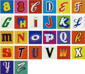
This one is my favorite.
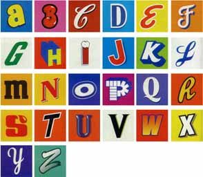
I like that as I look at these letters, I usually can guess very fast which product labels they were taken from. That's part of why the corporations involved got mad. We really do have a strong commercial culture in America, and this alphabet shows just how powerful the imagery of that culture can be. I enjoyed going to the artist’s site, where there are lots more examples of her letter combinations.
There's an interesting article in the New York times that Matthew just brought to my attention, and since I'm out of time for my post today, I'm passing it on.
The thesis of the article seems to be that, yeah, architecture matters. Here's a quote:
Le Corbusier called houses "machines for living." France's housing projects, as we now know, became machines for alienation. In theory, the cause of this alienation is some mix of the buildings themselves and the way they're joined to the city. But in practice, the most effective urban renewal has tended to focus on the buildings. It focuses on the buildings by razing them.
Could it be that these houses were so bad that they actually are responsible for social unrest, spontaneous violence, and general human unhappiness? Is that even reasonable? It looks a little like scapegoating to me, but at least they aren't blaming the Louvre.
This article isn't alone, by the way. In fact, the failure of modern architecture to be the promised utopia was a catalyst that brought about post-modernism, that great enigma of art, philosophy, and life. More about that later. I promise.
Anyway, have any of you ever been in an architectural space that just made you feel like a hoodlum? I have. Low ceilings and happy me don't mix.
A while ago, my brother-in-law expressed some interest in an Outsider Art post. His birthday is some time in the end of November, so Happy Birthday. And I call myself family.
Anyway, there are those out there that argue that if you want to figure out what something is, take a look at what it is not. Here's a good nerdy page about this. I always think of the reverse proof when it comes to Outsider Art because in declaring themselves "outside" they have, of necessity simultaneously designated an art "inside". In other words, they have designated what it takes to be a real, legitimate, actual-factual artists, and are saying, "not me" or "not them" which ever the case may be.
Outsider Art is discussed in scholarly journals, exhibited in galleries here and here and here, sold at auction, etc. Looking at the trappings of the art industry that surround them, it looks for all the world as though the outsiders are insiders.
So maybe they are "outside" in a completely different way. Outsider Art is typically spoken of in the same breath with Art Brut, folk art, intuitive art, naive art, visionary art, and children's art, all of which are (among other things) done by people without formal training in the arts. But there are plenty of people without formal training in the arts who are thoroughly "inside". Here's an example:

This is Henri Rousseau's 1910 The Dream. Rousseau had no formal training, but his images are included in any self-respecting book about modernism. Maybe he's "inside" because he so desperately wanted to be.
Anyway, I still have to question the grounds for "outsider" and "insider" status. I'm not sure I really understand how to tell who is who.
Today I’ve got two examples of artists putting Mother Nature to an artistic task. I like both of these a lot, so there is my clearly stated bias.
The first are individual leaves with images burned into them by the sun. No, that’s actually backward. The artist, Binh Danh, put negatives of the images over the leaves, and the chlorophyll under the darker parts of the negative died and became white. This isn’t a fast process. Most images need a couple of weeks to really “develop”. To preserve the leaf and the image, Danh encases them in resin. Check out some of them here.
The second example comes from the artist team Heather Ackroyd and Dan Harvey. Like Danh, they use varying intensities of light to transfer images to greenery. Unlike Danh's individual leaves, they transfer images to big patches of grass. They are relying on a genetically modified variety of grass to pull this off. Check out some of their projects here—I think they are soooooo cool.
The thing that I think is great about these artists and what they are doing is that although their process can be distilled to something quite similar, the outcomes of their work differ greatly.
It seems like such a good idea, Activist Art. People look at art, and they try to figure it out, and maybe they take something with them from the experience. Why not have that 'something' be a message that could change their world-view, or at least the way they take a shower?
That’s exactly what is behind The Running Tap, and you can read all about it here. Essentially, an artist has decided to leave a faucet running full force for a year. In the course of that time 200,000 liters of water will come and go through the House Gallery in Camberwell, south London before 27 June 2006 where this bit of Activist Art is taking place.
Here’s what the artist, Mark McGowan has to say about it:
"The piece is directed towards individuals. I've told them stuff like how you can waste up to 100 litres of water doing your washing up under a running tap, to draw attention to why I'm doing it."
As a person deeply committed to art and to the appreciation of it, and to the systems that promote and preserve art and the public’s access to it, I have to take issue with this piece. The idea is at best, half developed. Excessive waste to moralize against it? With more thought and effort I think McGowan could have come up with something far less hypocritical and better able to express the actual idea. To me, the best or most art-like part of what he has done is to expose our already-there sensitivity to waste. Everyone who sees this feels an urge to turn it off—which is not a new reaction in the viewer. It doesn’t raise awareness of the wasteful aspects of water usage because anyone who sees it is going to pat themselves on the back that they aren’t nearly so wasteful as this artist.
So anyway, all you activist artists out there, please be careful.
One of the best movies I know of that introduces the idea of mathematics in western art is Disney’s 1959 Donald in Mathmagic Land. I’ve only seen it once, and that was a decade ago. Donald goes exploring in a magical world of numbers and the harmonies they create in many examples of nature and art. It gives a lot of “gee-wiz” type information, and I wish I had a copy, but not unless I can get it for a good price (used VHS for $50 on amazon? That’s a joke, right?).
Here is a nice snippet on quicktime if you want to see a bit of it.
I remember that the movie specifically discussed the golden mean, which is a ratio, a perfect form, that just somehow feels right. Here’s a picture
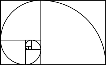
If you want to learn more about it, this site provides a good overview. Anyway, for a lot of Greek art, maybe for all Greek art, the mathematical principles Donald learns about are right there. The same is true of what we might as well call “Post-Greek” (Roman, Renaissance, Baroque, Neo-Classical, etc. etc.).
The math thing doesn’t seem to hold true for anything that isn’t Post-Greek, except for ancient Egypt—they’re in on the whole numbers thing. Anyway, I’ve never seen anyone try to make the math-underlies-everything argument for 11th century illuminated manuscripts, the art of Japan or China, or indigenous art in South America.
It is easy to think that the math as described by Disney and others is really universal—and I guess it is, so long as it is understood to be universal only among Post-Greek movements. This kind of "universal" is just as irrelevant as our eight note scale is for music outside the western world.
Happy Independence Day, Lebanon. I hope this year will be more independent than the last.
In honor of independence as a general concept, I’d like to discuss one of the ways independence plays out in the art world. In the last few decades, artists and critics have claimed that an image is never original, and if that idea is taken further, an artist never acts independently. Their work is always more or less a derivation, departure from, reaction to, or extension of something that happened first. The cascade of influences isn’t always easy to trace, so a lot of time goes into tracing it with greater or lesser success. Here’s a notable recent failure—where tracing foregoing influence led to an inaccurate correlation.
This site and this site reported recently on the similar appearance of the firefox logo and an obscure Georgia O’Keeffe painting. The two sort of look alike, but I’m pretty confident that the idea for the logo came from something else.
Anyway, I’ve been researching Sally Mann, and I came across this chain of photos, that I think is pretty interesting.
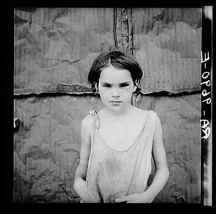
We start with Dorothea Lange's Damaged Child from 1936.
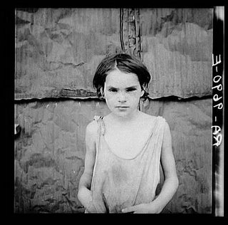
This actually is a damaged child, the child of migrant workers, dressed in rags.
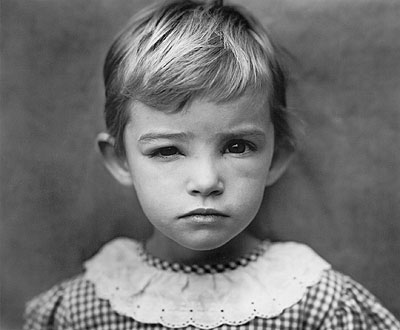
Now we have Sally Mann's Damaged Child from 1984.
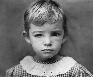
This is her daughter jessie, whose eye is swollen as a result of a gnat bite. She looks like the victim of some sort of abuse. Mann's photo and the title of it are references to Lange's.
Here's another damaged child from 2005.
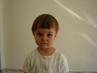
A hair cut went wrong. The photographer doesn't know anything about Mann's or Lange's damaged child. This image is "independent" of them even if my name for the picture isn't. So, like the firefox logo and the Georgia O'Keeffe painting, establishing a visual similarity doesn't establish any kind of original connection. Images are always the descendent of something, but in this case, it isn't what you'd think.
My November issue of Vogue (UK) has a lot of really interesting stuff in it, and one such thing relates to one of Art history’s many problems. They’ve published an article about photographer Diane Arbus, who committed suicide in 1971. Here’s a quote from that article.
. . . Arbus’ life and work, her reputation – all the things, in fact, that contribute to the enduring hold of the Arbus myth – are all but impossible to extricate from the fact of her suicide.
Its effect on the reception of her work was almost instantaneous. It was one of the reasons why so many people who were otherwise uninterested in photography flocked to the 1972 retrospective at the Museum of Modern Art in New York. And it continues to play a part in luring crowds to the far more comprehensive show of her work now at the V&A.
For more information about the exhibit click here.
So, about art history. While Arbus was alive and making pictures, she obviously wasn’t dead at her own hands. Suicide, even if she was morbidly obsessed with death, wasn’t the great punctuating mark at the end of her life because her life wasn’t over. The same is true of Van Gogh or any other artist whose suicide has become the final word about their art.. What if these suicides hadn’t been—what if they were simply (to a greater or lesser degree) nuts and died of old age? Would their works mean something else, or something less? Should we go back and re-evaluate art and rewrite history based on how an artist dies?
I don’t know if we should, and I don’t know if the author of Vogue’s article, Geoff Dyer, is right that Arbus’ legacy is inseparable from the mode of her death. This is a problem in all of history, not just art. We all respect Beethoven a bit more when we realize he went deaf. We find meaning in Hemingway’s suicide and the early deaths of musicians and actors. But prevalence doesn’t undercut the problematic nature of it for art and everything else.
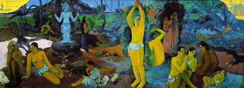
Sometimes artists work because they are bored. Sometimes they do it for the money or the fame. Sometimes they are just nuts and can't do anything else. Some do it for the love of creation. Some claim it is destiny. Sometimes they set out to do something really important, and that's what we are talking about today. Art that sets out to answer The Big Questions.
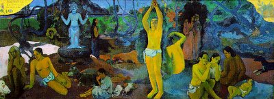
This is Paul Gauguin's Where Do We Come From? What Are We? Where Are We Going? interestingly, these questions are addressed from right to left.
This piece is pretty big in real life. The short side is over 5 feet long. Under the theory that important=big, I'd guess that Gauguin had a lot of faith in his answer to these pressing life questions. To read an explanation of the painting click here. I don't think that Gauguin was successful in answering the questions, but if he was he'd be some kind of prophet. I think it is a good piece of art even though it fails to do what the artist wanted it to do. I dont' think that's a problem. Why should the artist be required to see the end from the beginning? That would really take a prophet. Anyway, there are those that argue that the artist's intent doesn't matter anyway.
This is a rather famous painting by Jan van Eyck. You've probably see it or a parody of it before. It is a portrait of a wealthy merchant and his wife/bride (there's some debate about that) named Arnolfini. It is currently held in the National Gallery in London.
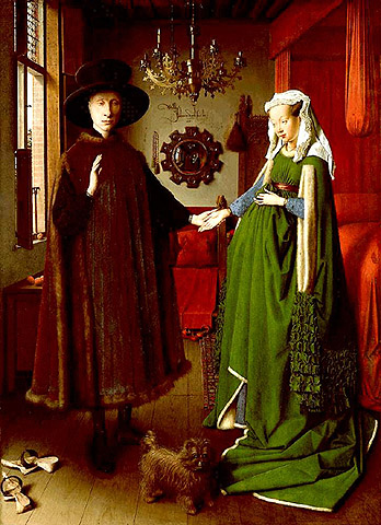
Here's a close-up of the mirror and beads between the couple in the background.

It was painted in 1434 and the original measures 82x60cm--tiny for having so much detail. Back in the 1400s paintings presented viewers with a piece of magic, a representation of their world that they could never have had otherwise. It was all about detail, symbolic meaning, and beautiful, flat, luminous paint. You'll have a hard time finding brushstrokes in this image, and that was part of the fun. The medium hides beneath the depictions.
Contrast that with the work of Rembrandt, 200 years later. This is a self portrait of his from 1669:

Click on it to get a bigger, better representation. Rembrandt left his footprint in the form of brush strokes. During the same time in Spain, Velazquez was painting in a similar style. Here you can see a close up of a little Spanish princess, whose dress is rendered so loosely that you could argue for the advent of impressionism 300 years early.
Of course, nobody left traces of themselves in painting to the degree that the abstract-expressionist, action painters, or oxidation artists did, but that’s for another day.
When I was two classes away from completing my BA degree I had a sudden urge to completely drop Art History in favor of Costume Design. This was brought on by a class the previous semester that focused on the history of dress in western society. I was fascinated, and my Art History training made the class all the more interesting. Parallels were everywhere.
So, two classes left to graduation not withstanding, I started taking the foundation classes for a degree in Costume Design. Becuase Costume Design fell under the canopy of theater and media arts, one of these classes was on theater history. In one semester we studied the highlights of western and eastern civilization's dramatic arts from ancient times through the Renaissance. Interesting stuff, and I learned a lot too. I even enjoyed it.
But there was one day when I realized that I didn't belong. The lecture turned to the role of theater in society. The professor recounted an experience in which he knew that he wanted to spend his life working as a play write. "Isn't that why we are all here? Aren't you in this major because you believe that theater can change lives?" He asked if anyone in the class wanted to share a theater-changed-my-life experience of their own. I sat there like stone as student after student spoke of heart-expanding, soul-defining, character-forming, tear-jerking, life-changing moments--all connected to seeing or performing or reading plays.
So there I am sitting there like stone while my fellow students were as one experiencing a catharsis of mutual meaning.
The next semester, I took my last two classes and graduated. Sometimes I wish I had chosen a more employable degree, like Art Education or Graphic Design. But I have no regrets about walking away from theater.
The very first real art text that I ever read was Claes Oldenburg’s 1961 "I am for an Art . . ." I was 17, majoring in photography, and had to read something and write about it for a drawing class I was in. It was by far the most accessible text of its class, which is probably why I chose it. At the time it was written, Oldenburg had this "store" that doubled as his studio/gallery and "I am for an Art . . ." was his statement. There are some real gems in it, and it is too long for me to put all of it here, so go read it here if you want to.
Here’s a selection:
I am for Kool-art, 7-UP art, Pepsi-art, Sunshine art, 39 cents art, 15 cents art, Vatronol Art, Dro-bomb art, Vam art, Menthol art, L & M art, Ex-lax art, Venida art, Heaven Hill art, Pamryl art, San-o-med art, Rx art, 9.99 art, Now art, New art, How art, Fire sale art, Last Chance art, Only art, Diamond art, Tomorrow art, Franks art, Ducks art, Meat-o-rama art.
I am for the art of bread wet by rain. I am for the rat's dance between floors.
Wet bread? Last Chance art? He goes on like this for a long, long time, and it is hard to think of any kind of art that isn’t on his list. Maybe that would be a book to write: The Art Oldenburg Never Thought Of.
Even though some of the ideas are still a bit, well, non-arty (How art?), there is a lot of art out there that is exactly what Oldenburg was describing. It was only a year later that Andy Warhol started doing Pepsi-art, and about a decade later that he started sprinkling his canvases with diamond dust so that they glittered (Diamond art?).
At the time, I found so much beauty in the ugly world around me, and I felt a deep need to understand it and share it. I’d see rusted out fenders, peeling paint, mold, worn out leather, and so on and so on, and it just knocked me out. When I read "I am for an Art . . ." I felt I had found a kindred spirit buried in the decades-old text. Especially that bit about the rat's dance.
My ideas about art have evolved, or maybe broadened. I don’t need something to be beautiful anymore. But when I find beauty amid the rubble it still blows me away.
I have put off writing about art crime for a while, mostly because I'm no expert. It has been in the news a lot lately--domestic and internationl news, so nobody is off the hook this time. I have read with rapt interest about the Getty Museum's troubles. Frankly, it reminded me of all the great movies about stolen art. The list keeps growing the longer I think about it. And it also reminded me of some real life stolen art.
I've been looking into what can be done when art is stolen, lost, illegally seized, etc. First, there is Interpol, which has a art unit, and a sub-unit devoted t recovering Iraq's looted art. There is also a private organization called the Art Loss Register that keeps a database of lost or stolen art. It seems to me that they are more geared toward private property losses than the museum's worth of loss sustained in Iraq. They also emphasize their services for art lost during the Holocaust. And then there is the US government's Art Crime Team, a division of the FBI. NPR recently interviewed their chief, and you can listen to that here.
Looking at all this information impressed me on two counts. First, these agencies do a lot to recover lost and stolen art. Second, there is an awful lot of unrecovered loot out there. Where’s Indiana Jones when you need him?
Like other places, people in Beirut honk to say hi or to warn of an impending crash or to tell someone to get out of the way. Most other countries leave it at that, but locals here have done quite a bit to expand the honk’s potential. In addition to the foregoing "international" messages, people here honk at intersections with low visibility just to make sure that others are aware of them. Taxi drivers do it to let you know that they’ve got a vacancy in their cab just in case you want a ride. So there are two new uses: siren to warn of your approach and as advertisement for your services.

Now for another use of the car horn:
What you see here is a rhythm. If you aren’t any good at counting out rhythm, find someone who is and have them clap this out for you—or have them sing it. Better yet, have someone honk their horn to this rhythm for the rest of the day. That’s what I have been listening to for the last 10 months. For at least that long, honking has also become a political statement.
This is the rhythm of the words (in Lebanese Arabic) "Freedom! Sovereignty! Independence!" which was the mantra of the Independence 05 push that happened in the wake of the Hariri assassination.
At busy times of day I have a cacophonous chorus of this rhythm played out by a dozen or more foul-pitched car horns going on right outside my door.
Art and car horns have something in common. Both can be used to further political aims, but neither is very effective. Further similarities? Public art and car horns can both be very annoying to those who would rather not have to endure someone else’s idea of self-expression. Over the last 10 months I’ve tried to think of the honking as some kind of performance/activist art in the hopes that it would annoy me less. It hasn’t worked.
I was recently tagged--so I'm playing the game.
Seven things I plan to do:
1. Move out of Achrafieh
2. Write my thesis
3. Learn French
4. Be self-employed
5. Continue learning anything and everything
6. Continue Impart Art
7. Build a better widget
Seven things I can do:
1. Cut my own hair
2. Make stained glass windows
3. Design, pattern, sew, tailor anything
4. Recite the alphabet A to Z or Z to A with equal ease
5. Fool a German into thinking I'm one of them
6. Play the violin (quite) well
7. Advocate for myself and others
Seven things I can’t do:
1. Blend in in Lebanon
2. Listen to two different things at once
3. Tap dance
4. Water ski
5. Have a maid--not possibly
6. Cheat people
7. laugh without crying
Six things I say most often:
1. Oh my goodness! (happy)
2. Really?
3. Oh, I see.
4. Random extreme numeric exaggerations "I've seen that movie a million times!"
5. I hate this. . . .
6. Oh come on! (disdain)
Seven people I'd like to tag:
1. kathleen
2. suz
3. megan
4. terra
5. kat
6. jennifer
7. amy
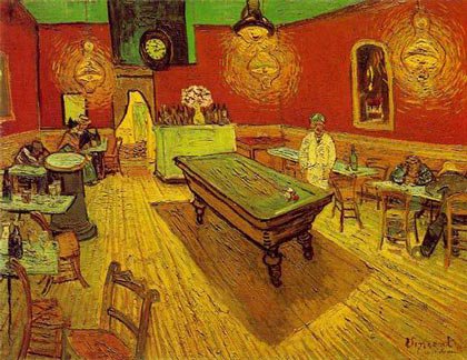
One year ago today, Matthew and I arrived in Beirut. We are older and wiser than we were then, but we still have lessons to learn. One of them reminded me of an art history lecture from my undergrad days. We were talking about composition, and the way the western artist’s sense of it changed when they saw the Japanese way of representing space. Van Gogh’s 1888 Night Cafe is a good example of some of the changes.
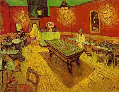
See how the floorboards are raked upward as they recede? That kind of angle was a very new thing in a Europe that still couldn’t quite let go of Renaissance perspective. But perspective wasn’t the only element of composition that changed. Even though the Night Cafe might seem pretty simple, it is actually a very complicated. Lets see if I can show you what I mean. Focus your attention on the bottom right hand corner of the image. Nothing there. Now look at the bottom left corner, which is rather cluttered with chairs and tables going every which way. These chairs are closest to the viewer. The pool table in the center is about as far back as the people sitting on the extreme right. So, how is it that the big empty foreground on the right and the crowded, complicated foreground on the left don’t look lopsided? Shouldn’t it? Shouldn’t it seem awfully unstable? Maybe it should, but for me it doesn’t. Somehow it works. That somehow is at the heart of today’s post.
My guess is that there are definitely people out there who would look at Night Cafe and feel like the picture was totally off kilter. I would further guess that if your most comfortable written language is read from right-to-left, you would have more trouble with this image that I do, being a native left- to-right reader. Here’s a simple overview of how looking goes: I see the cluster of chairs on the left first, and keep “reading” to the right, where there is nothing, and my eye comes to a rest in the middle on the pool table. But what about someone who approaches their visual world from the right, moving to the left? I imagine that they start with the big empty space on the right, and move right over to the left and get stuck in the gaggle of chairs.
To give you left-to-right readers an idea of what I think Night Cafe is like for right-to-left readers, here’s a mirror image of Night Cafe.
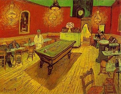
You are now up against the difficulties a right-to-left brain would have. I don’t know about you, but I feel like the reverse image is terribly off balance. Maybe a primarily Arabic, Chinese, or Japanese reader out there can tell me which Night Cafe they prefer.
Feminism has been on the list of ways to do art history for a couple of decades now. Linda Nochlin had a lot to do with that, writing about the way women are depicted as well as the way women depict. Interesting stuff to read, preferably with your salt shaker handy.
I'm not saying there isn't anything to the Feminist approach to art history. I would hate to see where art and society would be without the women's movement and I'm glad that I've reaped the benefits of it. All the same, I have some questions about the intersection of art and feminism.
Here's an Arthur Danto quote about art in the 1970s:
It was in those years . . . that a kind of radical feminist critique began to surface. . . . The argument was that it was false to the nature of women to apply to their work standards that had been developed in connection with the work of men. "There is no language of forms for women" is something Linda Nochiln said. My sense of what was meant was that women were doing things in these years which did not fall under definitions of art that were formalist in character, and were especially embodied in the criticism of Clement Greenberg. SO in effect the radical critique was an appeal to Pluralism of a kind, even if it somewhat sexualized the appeal, talking as if women did one kind of art and men another.
Ok, so what to say about that. First, I think there is a point to be made that men and women do not of necessity make different kinds of art. Certainly there are some men and some women whose work is so gendered that it couldn't have been made by the other sex. But what about the rest?
My second problem is a more general problem with feminism. By making gender the central point of analysis it becomes the most important consideration, providing the origin of all other meaning. I am uncomfortable with that because as an individual, I would so much rather be judged based on me--my choices, my accomplishments, my cares and concerns. To instead assess all that based on something I didn't choose is to subvert it, placing it secondary to something else. For some artists gender isn't secondary at all--but what about those for whom it is well and truly irrelevant?
Lets replace the man/woman thing with something else: nationality/ethnicity. I don't think that Europeans, or Africans, or the Chinese of necessity make art that must be examined within their nationality or ethnic origin. Certainly it might make a difference based on the particular concerns and work of each artist, but how much of one? Do we really need an independent art historical critique of each way of being?
This post is an extension of some ideas I discussed in relation to Russian Icons on Sunday. The purpose of that post was to show that some kinds of depiction, however detached from the subject matter, purpose of the image, or outside world they may be, never change.
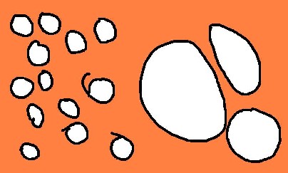
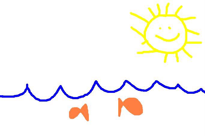
I'm guessing that most of the people who read this are as outside the Russian Icon thing as I am. With that in mind, I went to Microsoft Paint and made the following image:

I do hope that you all can relate to this image. We see the open sea on a clear sunny day. Below the rippling surface of the water we see two fish merrily going their separate ways.
For you reading this post, the representational conventions in my drawing ought to come right out of the lexicon of familiar images. But why? How is it that the scalloped blue line has come to represent water? I have never, ever seen water do that. Furthermore, I had not seen blue water until I was an adult. But I had been drawing blue scalloped water from the beginning. Why then, in the absence of actual water of that color and texture do I see the blue scalloped line and I think "water"? It is a very clever symbol perhaps, but not a depiction. The same is true of the Sun. I've also never seen little sunbeams darting out from the sun's edges, and I've never seen the sun smile. But all the same, when we look at these two representations we don't think "how strange". We think "sun" and "water".
Conventional representation happens a lot in cartoons, which is also a good place to find conventional music. If I had to think of a musical piece as stuck representation-wise as the blue scalloped line, I'd list Edvart Grieg's Peer Gynt Suites. A pastoral morning in a cartoon isn't complete without his "Morning Mood". If you aren't sure you know which piece I'm talking about, Amazon will let you listen. (you have to scroll down)
Thanks to this article on this new favorite site of mine, I am now more interested in this book than I am on my own thesis. Not a good road to go down, but I'll dig myself in a bit deeper by writing more today about said book than I have on my thesis in the last 4 weeks combined. *Sigh*

This book hasn't been released yet in the US, but is available in the UK. It contains some of the most ghastly travesties of design, the most recent of which come from the stormed palaces of Iraq. I remember seeing some of it on CNN, and thinking, "Wow. Here's a man with complex problems." Maybe you remember the gold toilette? Well, it turns out that other dictators have the same trouble when it comes simultaneously asserting authority and good taste.
Dictators have a notoriously bad influence on the arts. They stifle, they condemn, they shamelessly patronize those that produce the right blend of kitsch, activist art, and agit-prop. Under dictatorship, art must be a political tool in the arsenal of the leader. Hitler famously staged art exhibitions of "Degenerate" art opposite exhibitions of State-sanctioned "Correct" art. Anyone interested in Hitler's use of art ought to see this, which is the best movie I know of on the subject. Some have argued that Hitler's architectural sense was a bit better, but that's hardly a virtue considering how bad everything else was.
Now that I look at it, I actually have written much more than this on my thesis, and that makes me feel somewhat better.
Nathaniel Hawthorne is probably best known for The Scarlet Letter, but he also wrote The Marble Fawn, which provides some insight into what it was to be an American and an artist before modernism began fomenting change.
Midway through the second chapter of that book, three Americans (Kenyon a sculptor, Hilda and Miriam, painters) are discussing some of the antiquities in the Capitoline Museum. Kenyon is speaking about the Dying Gaul:
"I used to admire this statue exceedingly," he remarked, "but, latterly, I find myself getting weary and annoyed that the man should be such a length of time leaning on his arm in the very act of death. If he is so terribly hurt, why does he not sink down and die without further ado? Flitting moments, imminent emergencies, imperceptible intervals between two breaths, ought not to be incrusted with the eternal repose of marble, in any sculptural subject, there should be a moral standstill, since there must of necessity be a physical one. Otherwise, it is like flinging a block of marble up into the air, and, by some trick of enchantment, causing it to stick there. You feel that it ought to come down, and are dissatisfied that it does not obey the natural law."
"I see," said Miriam, mischievously, "you think that sculpture should be a sort of fossilizing process. But, in truth, your frozen art has nothing like the scope and freedom of Hilda's and mine. In painting there is no similar objection to the representation of brief snatches of time; perhaps, because a story can be so much more fully told in picture, and buttressed about with circumstances that give it an epoch. For instance, a painter never would have sent down yonder Faun out of his far antiquity, lonely and desolate, with no companion to keep his simple heart warm."
"Ah, the Faun!" cried Hilda, with a little gesture of impatience; "I have been looking at him too long; and now, instead of a beautiful statue, immortally young, I see only a corroded and discolored stone. This change is very apt to occur in statues."
"And a similar one in pictures, surely," retorted the sculptor. "It is the spectator's mood that transfigures the Transfiguration itself. I defy any painter to move and elevate me without my own consent and assistance."
"Then you are deficient of a sense," said Miriam.
--
There are conversations like that throughout the novel. The ideas are now almost 150 years old and the focus of the debates over the nature, capacity, strengths/weaknesses of sculpture and painting have changed. Kenyon's statement of the viewer's importance "I defy any painter . . . " is remarkably apt. Today we are very likely to adopt a to-each-his-own view of art, but that one of Hawthorne's characters acknowledges the importance of the viewer is remarkable even if Miriam thinks he's hadicapped for it.
A lot of people really hate the commercial aspect of art, and I can't say I blame them. We look at the foibles of taste, the fashion victims, the travesties of novelty, and we shudder. And then we read about the emperor's new clothes, the power of wealth, the influence of the elite, and we cringe. And those who love art can't help but hope against hope that art will somehow remain noble amid the squalor.
There are of course, moments when art has been able to produce something mighty fine amid these treacherous conditions. And they are treacherous. Capitalism was able to convince women that they looked better with shoulder-padding worthy of highschool football, and if that is possible, woe unto art.
But back to the point--art has done some impressive things with the commercial atmosphere that simultaneously enables its survival and threatens to choke it out of existence. On my list of favorites from the contemporary world is an exhibit from 2003 by David Shapiro. I heard about it on NPR, and you can too, here.
Consumed is the kind of art that is a mirror held up to ourselves. Commerce is what enables our entire existence. "Our" is appropriate here--because mankind doesn't need it--but probably everyone who ever reads these words is part of a commerce driven reality. Even if you aren't a compulsive shopper your food comes in packages, your clothes came off a rack ready to wear, and your shelter is designed to need as little work from you as possible to stay warm and dry.
So, we consume, and we do it a lot every day. David Shapiro spent two years saving all the packaging of things he consumed (food, drinks), cleaned it up, and put it on grocery-type shelves in a gallery.
I think this is art because it tells us about ourselves, and tells us things we might not have realized otherwise. It contextualizes consumerism within an art context, and I like seeing those tables turned.
Of all the crazy stuff that happened in the 20th century it is important not to forget some of the more traumatic moments in the arts. There are more than the two I will discuss in this segment, but these two seem to be a good mix of extremity and accessibility.
Invisible Art
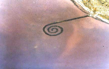
Although there are a lot of examples of this, the one that I think is best suited to the occasion is Robert Smithson’s Spiral Jetty.
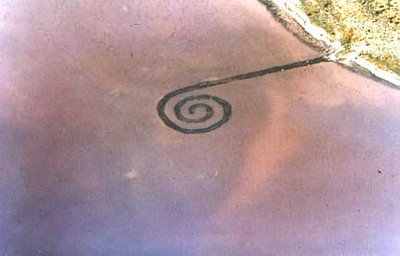
This belongs to a movement known as Earth Works. Artists started rearranging or manipulating or “sculpting” the landscape to produce a work of art. There were a lot of reasons why artists started doing Earth Works. Some liked that you couldn’t really buy it or sell it at auction, you couldn’t put it in a museum, you couldn’t reproduce it as one of a series.
So back to the Spiral Jetty. Smithson made it in 1970, and ever since, it has been there, and then eventually not been there as the water level of the Great Salt Lake has risen and fallen. Of course, it is still there, but there are times when you can’t see that it is. It was for this reason that I never saw the Spiral Jetty even though I lived not far away for quite a while.
Silent Music
As I’ve already admitted elsewhere, I’m not that knowledgeable about music. I know enough to know that I really don’t know enough—um, yeah.
Every now and then, something I come across in the world of music really sticks in my mind, and John Cage’s 1952 piece 4’33” is part of that crowd. For three timed sections, the musician is silent—plays nothing—and then it is over.
So admittedly these things are a bit crazy. What is the point of art that can’t be seen and music that can’t be heard? In the case of 4’33”, there was arguably no music to listen to in the first place. At least the Spiral Jetty was there even if it out of sight for a few years. So, reader, you tell me. Is this sort of thing ok? Is it conceptualism gone too far?
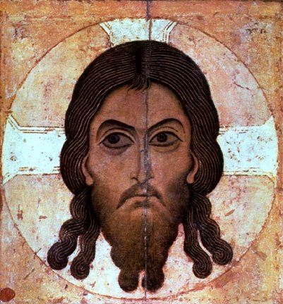
Today the subject is Russia, and particularly Russian icons. The first that I’d like to reference is from the Novgorod School, dating to the 12th century. It gives a depiction of Jesus—pretty straightforward, typical icon stuff.
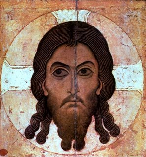
I’d like to point out some very indicative traits this work has. First, the gold back ground is oh so Byzantine. Jesus’ face floats in the sea of gold. Notice also how this flattens the image. The rendering of the face is stylized almost to the point of abstraction. Curls of hair are reduced to repeated patterns.
Now look at this painting that for all I know was done yesterday. Rev. Andrey Davydov’s studio continues to create icons that abide by the same conventions that governed most of Byzantine artistic production. As a westerner too used to change for her own good it is interesting to see art that hasn’t. 900 years have passed, but it would take an expert tell you that.

These icons show an important element of art creation. Artists know that viewers become accustomed to certain stock images. These images pull up stock associations and reactions in viewers that make the communicative power of art more certain. Or at least they are intended to. As an outsider, I have to wonder if the gold background, the almost abstracted features, the strange almond shaped eyes are imperative to the job icons perform. My guess is that they are. But that is the trouble with conventional representation. It only works for those who are already well versed in the meanings of the stock images. By speaking directly to some, others aren't spoken to at all.
Ok, so I really am a nerd. I love art games, and I sort of collect them. About four years ago I got my very own, very first art game. I was for sale in the Kunsthalle Mannheim, and my sisters picked it up for me. I’m still glad that they did. It is a very simple memory game. Each pair is comprised of two selections from a single painting in either the Alte or Neue Pinakothek in Munich.
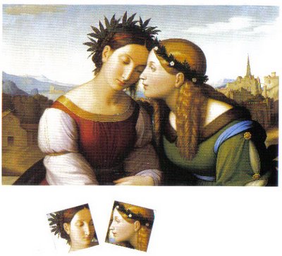
This is an example of one painting and pair set taken from it. I took this image from the handy little information booklet that came with my game. It is Johann-Freidrich Overbeck’s 1828 Italia and Germania. In this painting Overbeck indicates two opposing forces in his art experience—the Italian masters and their aesthetic, and the Germanic masters and theirs. Here, personifications of the two are seated together as friends. It is an interesting attempt to both literally and figuratively reconcile the two artistic forces.
I’ll go into greater detail abut the difference between Italian and Germanic painting in the future. Anyway, I love this memory game because of pieces like this in it. Paare contains 36 pairs that cover almost 500 years of European painting.
Happy sixth anniversary to me, and to my husband.
Looking at art is actually a rather complicated thing. The more you know about art and its history, or about the artist, or about art criticism, or the confluence of art and society, the more complicated it becomes. Well, in view of the heaps and mounds of stuff to consider, some began advocating that what art viewers needed most was an "innocent eye". Art, they believed, ought to be judged independent of all of the art world's history, baggage, and implications.
But let’s think about that for a moment. Is that wish even possible? Can anyone with the gift of two eyes and a brain connected to them refrain from making judgments based on what they have already seen? Furthermore, can anyone who has read anything about art just completely NOT think about those things when something in the visual world recalls them?
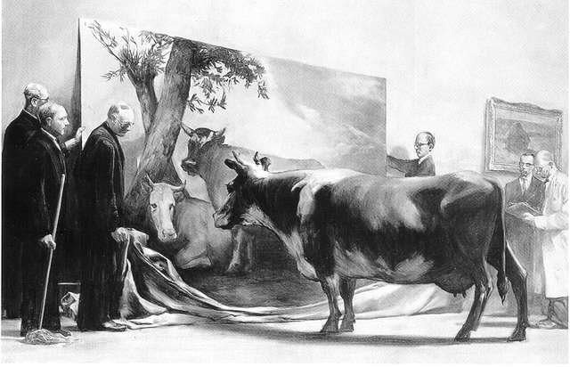
Consider the following painting in that context.
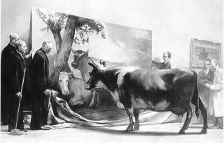
This is The Innocent Eye Test by Mark Tansey, 1981. It is a very clever piece and volumes could be and have been written about it. What you are looking at is a cow, brought into the gallery to test Paulus Potter's image called Young Bull, a classic, naturalistic painting from 1647. Tansey has also painted in some art-types standing there like so many suits. In the background, you may be able to identify one of Monet's haystacks.
Tansey's painting depicts the moment when the museum-folk have let the drapery fall. They (and we viewers) await the judgment of the cow. If the cow is convinced that she is seeing a hot young bull, then we will have our answer. Finally, we will know if Paulus Potter was any good. After all, the cow's judgment couldn't possibly be anything but innocent.
Do we want that? Certainly, the art's baggage is a cumbersome and difficult thing. But without it, we are as ignorant as the cow and not nearly so innocent.
This is the second of it's kind. To read the first, click here.
Many different arts have their histories divided into periods, movements, styles, etc. For example, Music, Literature, Dance, and Fine Art all have a Romantic period. Josh pointed out not long ago that there isn't much continuity of meaning when you jump from one art to another. In other words, the influences acting on Baroque music are hard to reconcile to the influences that shaped Baroque architecture. The specific case was Impressionism. While I was thinking about that I remembered something else that is rather important whenever the discussion turns to art history.
The idea that history progresses in movements and periods and ages and eras is usually a construct of the present looking back at the past, recognizing macro-trends and generalizing about them. This helps us make sense of history and allows us to sequentially progress from one phase to the next.
Sometimes art doesn't easily lend itself to being "periodized", and artists don't fit neatly into a movement. That is exactly what happened with Pop Art. Time magazine ran an article called "The Slice of Cake School" in its May 11, 1962 issue. The writer noted that several contemporary artists had, "come to the common conclusion that the most banal and even vulgar trappings of modern civilization can, when transposed to canvas, become Art."
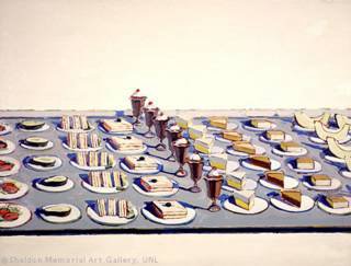
Who was included in the Slice of Cake School? Time magazine lists Wayne Thiebaud, Roy Lichtenstein, James Rosenquist, and Andy Warhol. The photo credit goes to Thiebaud, who was the only one actually doing cake. It was an uncomfortable school to be sure, and even today, historians are very hesitant to refer to a Pop Art style, because stylistically, each artist was on his own.
Interestingly, Pop Art is one of the last movements that Art History can really point to. After that point, pluralism set in, the art world fractured into a hundred different segments going as many directions. Maybe our grandchildren will be able to look at what the '80s or '90s produced and find a macro-trend and make it into a movement or a period. If they can't, it may prove Arthur Danto right.
The 1950s produced some absolute masterpieces of cinematography, and among them is the classic All About Eve. It is the story of a star struck young girl who claws her way to the top of the New York theater world. The viewer observes the behind-the-curtain lives of those at the top, and among them is a critic. Played by George Sanders, he introduces himself in the beginning of the film:
To those of you who do not read, attend the theater, listen to unsponsored radio programs or know anything of the world in which you live - it is perhaps necessary to introduce myself. My name is Addison De Witt. My native habitat is the theater. In it, I toil not, neither do I spin. I am a critic and commentator. I am essential to the theater.
This is actually a very important point about anything that can call itself art. There will be and always have been those who tell the public what to think. They may be worshiped, condemned, ridiculed or praised. But as De Witt points out, they are essential to the process. Why? Because most of the public wants to be told. The public wants someone with verifiable judgment, experience, and education to use it on their behalf. Very few people like being caught with an unpopular, or worse, uneducated opinion.
Ultimately, many things (and I include art) are a matter of judgment. Isn't that why we read the sports page to see how the writers think the teams, coaches, or athletes are doing? Isn't that why we read stock market reports and analysis of business? Aren't all the fashion magazines and news papers in the world published to inform the judgment of their readers? Like everything else in the world, art changes, and those changes are discussed, written about, and critiqued. Should it be otherwise?
I am going to write something today that I know I will regret. If anyone chooses to take issue with my comments here, just please remember that I knew it would happen.
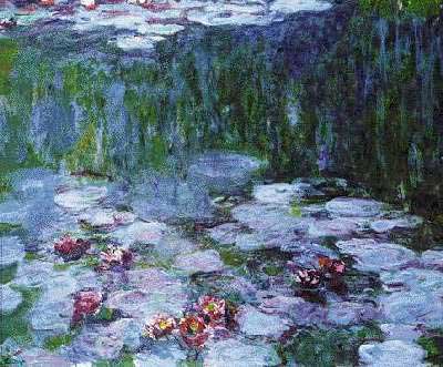
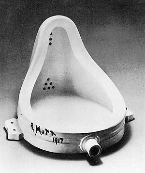
There is a big difference between smart art and stupid art, and a piece of art can be at first smart, and over time become extremely stupid. The reverse is also true. My two examples of the smart/stupid paradox come right out of the art history cannon. Quite by chance, the two images I have chosen were completed in 1917.
Smart art becomes stupid art.
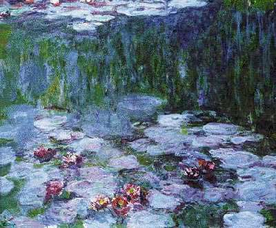
Right, further introduction might not be necessary, but for the record, it's by Claude Monet, one of his many, many waterlilies. Waterlilies (incorrect but consistent spelling) is practically synonymous with Monet, and they are among his most recognizable work. At the time (1917) Impressionism had seen its day and was on the wane. Post Impressionism had come and gone. But Monet was a master, and Expressionism in all its variety owes him something for his very new approach to seeing, depicting, painting. In 1917, Monet was still a bit of a rebel. But that isn't why people like Monet today. They like it because it is pretty. And it is that. Incidentally, I saw one of this genre in the Kunstmuseum Basel back in 1997, and it was far more impressive in real life. I suggest, however, that the artistic value of Monet is found in what is unique about his work, and sadly, pretty isn't unique when we are talking about art. Monet's work offers much more than a pretty face, but you'd never know from the bathrooms you'll find it in.
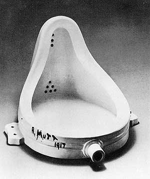
This one needs a bit more introduction, I think. This is a urinal, perpendicular to the wall instead of parallel to it, and relabeled "fountain" by Marcel Duchamp. Duchamp submitted this piece to a juried exhibit that said it would turn nothing away. He wanted to see if they were as good as their word, and they weren't. The piece, though arguably a prank, was not shown. Since that time, the question has become, "Why not?" That attitude still exists in the art world, and has been a driving force behind some of the more innovative things that have happened. But the thing I wish to point out is that Duchamp's idea was juvenile. This was not a deeply analytical work of art, or one that even Duchamp even meant to be art. It was the rejection of it that made it important. What started out very stupid has become smart.